

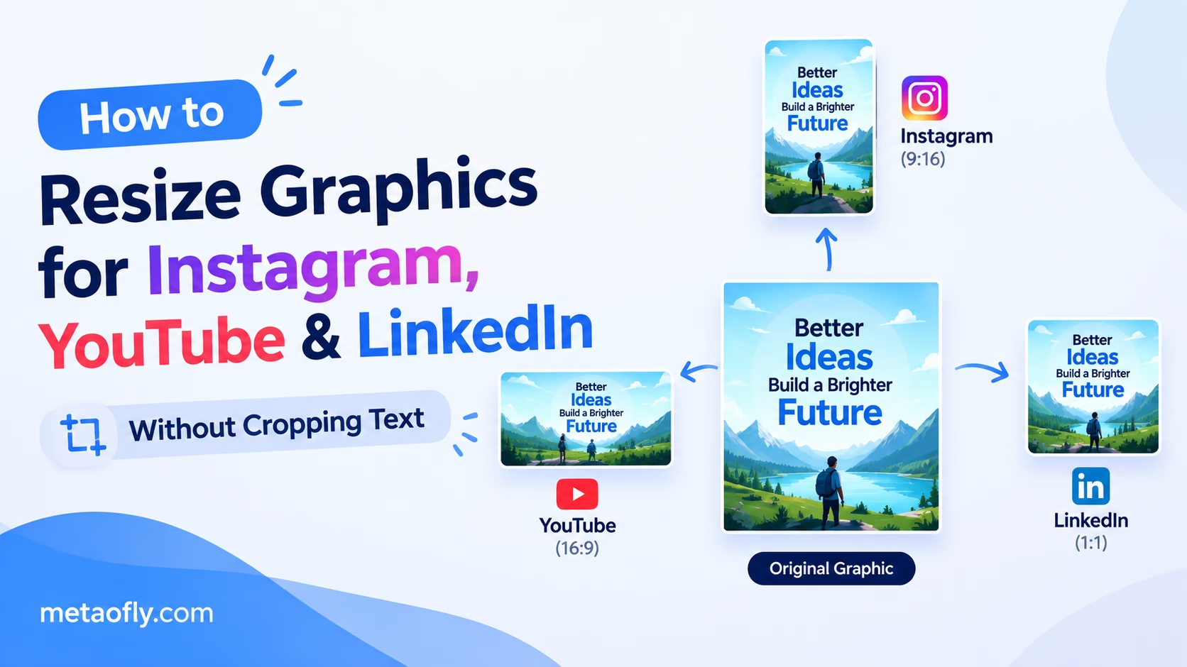
Editorial Technical Solution: Publishing marketing graphics across modern social networks requires managing a fragmented matrix of conflicting aspect ratios and dynamic mobile user interface overlays. Learning how to resize graphics for social media safe zones ensures that your brand typography, primary calls-to-action, and product focal points remain completely visible on every smartphone screen. MetaoFly Social Media Image Resizer provides intelligent canvas fitting, dynamic safe zone guides, and background blur fills—executing 100% client-side in your browser with zero server uploads.
Every digital marketing agency and solo creator understands the grueling friction of cross-platform social distribution. You invest hours producing a breathtaking promotional graphic, only to discover that Instagram’s 4:5 vertical feed crops your headline text, TikTok’s right-hand engagement icons cover your company logo, and LinkedIn’s feed algorithm centers your graphic with jarring black letterbox bars. Navigating this multi-platform chaos without having to redesign each creative from scratch is an essential superpower. Knowing how to resize graphics for social media safe zones allows you to repurpose a single master promotional asset across dozens of social destinations in seconds, protecting critical messaging while maximizing organic engagement.
MetaoFly Social Media Image Resizer
Instantly resize, crop, and pad visuals for Instagram, YouTube, TikTok, LinkedIn, and X with real-time safe zone overlays and zero compression blur.
The Viewport Dilemma: Why Social Platforms Truncate Important Text and CTAs
The fundamental challenge of modern social media asset production lies in the severe divergence between creator authoring environments and consumer consumption devices. Designers craft visual campaigns on wide 16:9 or 16:10 desktop monitors with ample screen real estate. Consumers, however, encounter those assets on tall, narrow smartphone touchscreens ranging from 5.4-inch compact devices to 6.8-inch phablets.
To compound this challenge, major social platforms overlay permanent interactive interface elements directly on top of your published media. On Instagram Reels and TikTok, the bottom 20% of the screen is obscured by user account avatars, audio attribution tracks, and caption overlays, while the right-hand margin is occupied by like, comment, bookmark, and share icon stacks. If an art director positions a vital promotional discount code or call-to-action button in the lower-right quadrant, it becomes completely unreadable beneath these native platform controls.
Similarly, feed algorithms apply dynamic cropping behavior based on device context. Instagram displays vertical 4:5 images in the main home feed, but truncates those same images into 1:1 squares when visitors browse your primary profile grid. LinkedIn’s desktop feed favors wide 1.91:1 horizontal links, but its mobile smartphone application displays posts within a compact card structure that clips horizontal extremities. Without precise safe zone pre-flight planning, crucial copy and brand identities are routinely severed.
According to user interface design principles documented in the Apple Human Interface Guidelines, touchscreen touch targets and critical typographic messaging must always reside within protected safe margins to guarantee comfortable viewing ergonomics and prevent accidental tap triggers on underlying operating system gestures.
Aspect Ratio Mechanics: 1:1 Square, 4:5 Portrait, 9:16 Vertical, and 16:9 Landscape
Mastering social graphic production requires fluency in the mathematical aspect ratios that govern digital feeds. Understanding these dimensional standards allows you to anticipate how visual content translates across viewport contexts:
- 1:1 Square (1080×1080 px): The original universal social standard. While square images have surrendered feed dominance to taller portrait formats, 1:1 remains the gold standard for Instagram profile grids, carousel carousels, Facebook desktop carousels, and LinkedIn company updates.
- 4:5 Vertical Portrait (1080×1350 px): The highest-converting format for organic feed visibility on Instagram and Facebook. By occupying approximately 25% more vertical viewport height than square graphics, 4:5 visuals command user attention, slow down rapid scrolling thumbs, and maximize visual engagement before the user reaches the next post.
- 9:16 Full-Screen Vertical (1080×1920 px): The dominant immersive container for TikTok, Instagram Stories, Instagram Reels, YouTube Shorts, and Snapchat. While 9:16 offers total screen takeover, its effective “safe zone” for text is heavily restricted by top header bars and bottom caption trays.
- 16:9 Widescreen Landscape (1920×1080 px): The standard for YouTube long-form video thumbnails, X (Twitter) link previews, and desktop-focused LinkedIn blog headers. On mobile devices, 16:9 graphics appear relatively small in vertical feeds, requiring bold, high-contrast typography to remain legible.
Platform-by-Platform Safe Zone Specs: Instagram, TikTok, LinkedIn, YouTube & X
To protect your typography from being covered by native platform UI buttons or severed by automated algorithmic cropping, adhere to the following verified safe zone coordinates:
| Platform & Placement | Master Canvas Dimensions | Aspect Ratio | Protected Safe Zone Bounds | Critical UI Elements to Avoid |
|---|---|---|---|---|
| Instagram Feed Post | 1080 x 1350 px | 4:5 Portrait | Central 1080 x 1080 px | Top and bottom 135px cropped on profile grid |
| Instagram Story / Reel | 1080 x 1920 px | 9:16 Vertical | Central 1080 x 1420 px | Top 250px (status bar), bottom 250px (captions/audio) |
| TikTok Full-Screen | 1080 x 1920 px | 9:16 Vertical | Central 900 x 1200 px | Right margin 140px (icons), bottom 320px (captions) |
| LinkedIn Feed Post | 1200 x 1200 px / 1200 x 627 px | 1:1 / 1.91:1 | Central 80% of canvas | Edge margins on mobile app viewport cards |
| YouTube Video Thumbnail | 1280 x 720 px | 16:9 Widescreen | Central 1100 x 640 px | Bottom-right corner timestamp duration badge |
| X (Twitter) Feed Card | 1200 x 675 px | 16:9 Widescreen | Central 1000 x 600 px | Bottom-left link domain attribution badge |
Why You Need to Resize Graphics for Social Media Safe Zones Without Content Loss
When creative teams confront the necessity of multi-platform adaptation, they typically face two unappealing options in traditional image editors: destructive hard cropping or unsightly black pillarboxing.
Destructive cropping occurs when an automated tool naively slices off the outer edges of an image to fit a new aspect ratio. If you attempt to convert a wide 16:9 graphic into a tall 9:16 Story using basic center cropping, the tool discards over 60% of horizontal content, obliterating flanking team members, peripheral product details, and wide text headlines.
Letterboxing or pillarboxing inserts solid black or white bars to fill the dimensional discrepancy. While this preserves all source pixels, it looks amateurish, destroys visual immersion, and signals to the social audience that the creator took a low-effort shortcut. Furthermore, algorithmic feed curators on Instagram and TikTok actively de-prioritize posts featuring prominent letterbox borders because they degrade the sleek, edge-to-edge aesthetic of modern mobile feeds.
The professional solution is intelligent canvas extension. MetaoFly Social Media Image Resizer provides sophisticated content-aware adaptation techniques. By employing background blur mirroring—where the source image is duplicated, scaled, and softly blurred behind the pristine original—the tool fills excess canvas space with harmonious ambient colors that feel custom-tailored for the destination format. Alternatively, users can choose smart color-matched canvas extensions or custom framing to gracefully resize graphics for social media safe zones while preserving 100% of original visual assets.
Key Technical Takeaways
- Always center critical text, logos, and call-to-action buttons within the middle 70% of 9:16 vertical canvases.
- Leave at least 250 pixels of clearance at the top and bottom of TikTok and Instagram Reel creatives.
- Avoid placing text or important faces in the bottom-right corner of YouTube thumbnails where timestamps sit.
- Use ambient blurred background fills instead of harsh black letterbox bars when adapting landscape art to vertical feeds.
Pro Engineering Tip: The Thumbnail Duration Badge Trap
On YouTube, the video duration timestamp badge (e.g., ’14:28′) is permanently rendered in the bottom-right corner of your thumbnail across all search results and recommended feeds. Never place sponsor logos, pricing text, or facial focal points in that lower-right corner, or they will be permanently obscured.
Step-by-Step Blueprint: Repurposing a Single Master Asset Across 6 Platforms in MetaoFly
Transforming one master creative asset into an entire suite of pixel-perfect social assets takes less than 60 seconds using MetaoFly’s streamlined browser workflow:
Step 1: Launch MetaoFly Social Media Image Resizer
Navigate to MetaoFly Social Media Image Resizer. Because the utility operates client-side inside your browser tab, there are no software downloads, monthly subscriptions, or account logins required.
Step 2: Upload Your Master High-Resolution Creative
Drag and drop your primary high-resolution visual into the upload canvas. For optimal results across all outputs, begin with a master creative at 1920×1080 (landscape), 1080×1080 (square), or raw camera-resolution (4K). MetaoFly immediately analyzes the source aspect ratio and displays your image at full clarity.
Step 3: Select Target Destination Presets
Click the platform preset selector. MetaoFly features pre-configured, pixel-exact templates for every major channel:
- Instagram: Feed Portrait (1080×1350), Feed Square (1080×1080), Story / Reel (1080×1920).
- TikTok: Full-Screen Vertical Video Cover (1080×1920).
- YouTube: Video Thumbnail (1280×720) and Channel Banner (2560×1440).
- LinkedIn: Post Image (1200×1200) and Shared Article Header (1200×627).
- X (Twitter): In-Stream Graphic (1200×675) and Header Banner (1500×500).
Step 4: Enable Safe Zone Overlays and Position Focal Content
Toggle the “Safe Zone Overlay” switch. MetaoFly projects semi-transparent, color-coded boundary guides directly over your canvas, clearly highlighting platform UI cutoff lines, caption zones, and profile picture circles. Use the pan and zoom controls to position your primary text and subject matter safely within the illuminated green zone.
Step 5: Choose Your Background Fill Strategy
If your source aspect ratio differs from the destination container, select your preferred margin handling mode:
- Smart Blur Fill: Automatically extends the canvas with an aesthetically blurred, color-matched clone of the source image, creating an editorial broadcast aesthetic.
- Solid Brand Hex Color: Fills empty margins with your exact brand background color for a clean, minimalist card appearance.
- Exact Subject Scale & Crop: Scales the subject to fill the entire container edge-to-edge while allowing you to manually align the crop focal anchor.
Step 6: Export Crystal-Clear, High-DPI Social Assets
Click the “Export Image” button. MetaoFly uses bicubic canvas interpolation to render the final graphic at maximum pixel sharpness. The exported file downloads immediately to your computer with zero compression artifacts, zero watermarks, and zero file size restrictions.
Typography and Visual Balance: Ensuring Legibility on 5-Inch Smartphone Displays
A visually stunning graphic on a 27-inch desktop monitor can easily become an illegible smudge when scaled down to a 5.4-inch smartphone screen. To safeguard readability across all mobile viewing conditions:
Enforce the 3-Second Glance Rule: Social media users scroll through feeds at lightning speed, spending an average of 1.7 to 2.5 seconds evaluating a single post. Your primary headline text must be concise (under 7 words), set in a bold, sans-serif typeface, and sized large enough to be effortlessly read without zooming or squinting.
Guarantee WCAG Contrast Compliance: Never place white text directly over busy, variegated photographic backgrounds without an underlying scrim, drop shadow, or frosted translucent panel. Text elements should maintain a minimum luminance contrast ratio of 4.5:1 against the background to ensure legibility under harsh outdoor sunlight and across low-brightness mobile displays.
Limit Copy Density: Avoid packing multi-paragraph explanatory copy into a single feed graphic. Reserve the image for an arresting hook, key statistic, or compelling question, and leverage the post’s text caption for supporting exposition and detailed bullet points.
Cross-Tool Workflows: Preparing Assets for Image Compression and Vector Brand Badges
Social graphic resizing represents one vital component of a comprehensive content production workflow. By pairing MetaoFly Social Media Image Resizer with complementary MetaoFly tools, you can build an end-to-end creative assembly line:
After resizing your social creatives, run them through MetaoFly Image Converter & Compressor before uploading. Compressing your 1080×1350 PNG or JPG graphics down under 150KB strips unnecessary metadata and prevents social media algorithms from aggressively crushing your files with heavy, low-quality server re-compression that introduces unsightly compression banding.
If you are creating social promotional graphics for live events, retail pop-ups, or podcast launches, incorporate custom branded QR codes generated via MetaoFly Pro QR Code Studio. Positioning a high-contrast vector QR code within the safe zone of a LinkedIn or X feed graphic allows viewers browsing on desktop computers to instantly scan your asset with their mobile phones, driving seamless cross-device conversions.
Algorithmic Distribution and Click-Through Velocity: Why Safe Zone Compliance Drives Impressions
On modern recommendation-driven platforms like Instagram, TikTok, and LinkedIn, algorithmic content distribution is directly tied to user engagement velocity within the first 60 minutes of publication. Recommendation engines track micro-behaviors including dwell time, pause duration during rapid scrolling, and immediate interaction rates.
When a mobile user scrolls past a graphic where the primary headline is cut off or the call-to-action button is obscured beneath platform like/share icon stacks, their cognitive processing encounters immediate friction. Eye-tracking usability studies reveal that mobile users take less than 400 milliseconds to decipher a visual hook. If the text is clipped or difficult to parse, the user swipes past without pausing. This split-second hesitation deficit registers with the algorithm as low user interest, dramatically curtailing secondary distribution to broader Explore and For You page audiences.
By learning to resize graphics for social media safe zones, social media marketing teams ensure that every visual asset communicates with maximum visual punch the instant it enters the user’s viewport. Critical headline text is positioned dead-center where mobile thumbs never obstruct line of sight, driving instantaneous message comprehension and maximizing initial dwell time metrics.
Automating Cross-Channel Batch Resizing: A Workflow Guide for Busy Social Media Teams
Agency marketing teams handling multiple brand accounts cannot afford to manually rebuild visual assets in Photoshop for every individual social network. Implementing a structured, repeatable batch resizing workflow accelerates content velocity while eliminating human error:
- Standardize on a Master 4K Creative: Always design your initial campaign creative on a high-resolution master canvas (such as 3840×2160 or 2048×2048). Starting with high-density source pixels ensures that downsizing into 1080×1350 vertical or 1200×675 landscape formats produces razor-sharp raster output without blur.
- Establish Standard File Naming Protocols: Organize your multi-format exports using consistent suffix tagging:
campaign_asset_instagram_4x5.png,campaign_asset_story_9x16.png,campaign_asset_linkedin_1x1.png. This enables scheduling teams and social automation tools to route correct aspect ratios into their respective platform queues without confusion. - Verify Ambient Blur Margins on Dark Mode: When utilizing MetaoFly’s smart blur padding to expand landscape assets into vertical 9:16 Story containers, test your creative against simulated OLED dark mode displays. Ambient blur fills create an editorial aesthetic that feels native to modern smartphone interfaces, far outperforming crude solid black borders.
Common Pitfalls: Algorithmic Downsampling, Moiré on Mobile Screens, and Color Shifts
Avoid these subtle technical traps that frequently sabotage social media image quality:
- Uploading Excessive Resolutions: Uploading an 8000×6000 pixel camera-raw image to Instagram does not improve quality; it actually degrades it. When an image exceeds platform maximums, Instagram’s server-side ingestion pipeline applies aggressive downsampling with harsh sharpening filters, creating jagged lines and noise. Always resize your graphics to the platform’s exact native specifications (e.g., exactly 1080px wide) before uploading.
- Color Space Mismatches (CMYK / Display P3): Social platforms expect imagery in the standard sRGB color space. If you export graphics in CMYK (print mode) or Display P3 wide-gamut without conversion, social web viewports will misinterpret the color coordinates, resulting in dull, washed-out, or greenish skin tones. MetaoFly automatically normalizes all exports to universal sRGB.
- Moiré Distortion on Pinstripes and Grids: Dense pinstripe clothing, fine geometric mesh, or tight halftone dot patterns create severe moiré distortion when resized to mobile screen densities. When cropping and resizing, ensure fine patterns are softened or anti-aliased to prevent vibrating visual patterns on OLED smartphone displays.
Never Crop Out Another Headline
Resize and adapt your graphics for Instagram, YouTube, TikTok, and LinkedIn in seconds. Protect your typography with interactive safe zone guides and 100% private in-browser rendering.