
The Reality of Glassmorphism: Aesthetic Wonder vs Implementation Pitfalls
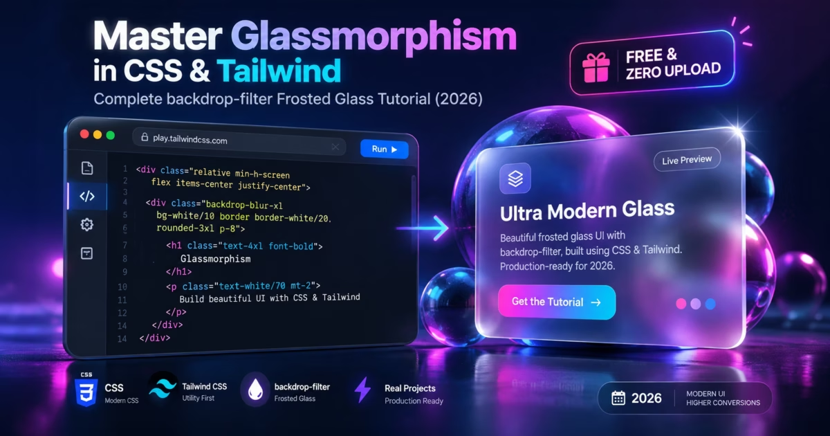
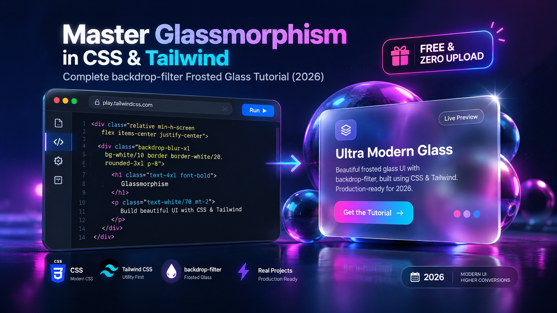
From Apple’s macOS Tahoe and iOS 18 interfaces to modern Web3 landing pages and Stripe dashboards, Glassmorphism (frosted glass UI) remains one of the most sought-after visual design styles in modern front-end engineering. When executed correctly, translucent glass cards establish distinct visual hierarchy, preserve contextual background continuity, and convey premium technical polish.
Yet, front-end developers routinely encounter three frustrating bottlenecks when implementing glassmorphism:
⚠️ The Safari Bug, Low Contrast ADA Liability & CSS Clutter
1. The Infamous Safari Backdrop Failure: Standard backdrop-filter declarations completely fail to render on WebKit engines (iOS Safari and macOS Safari) unless accompanied by the vendor-prefixed -webkit-backdrop-filter property. Without it, your card renders as an ugly solid gray or completely transparent box.
2. The Contrast & Accessibility Penalty: Careless transparency levels degrade text readability, violating WCAG 2.1 AA/AAA compliance standards. If dynamic background elements scroll behind translucent cards, contrast ratios plummet below the required 4.5:1 threshold, creating serious legal ADA accessibility liability.
3. The Guesswork of Multi-Property Stacking: True tactile glass isn’t just blur. It requires the delicate mathematical interplay of four simultaneous properties: alpha channel surface background, specular gradient border, inset light reflection, and ambient diffuse drop shadow.
MetaoFly engineered Glassmorphism UI Studio to solve these challenges completely. You get a live 2-column sandbox to visually calibrate blur, opacity, borders, and lighting against rich background presets, while automatically generating battle-tested, vendor-prefixed CSS and Tailwind utility classes.
Under the Hood: GPU Compositing & The Anatomy of Realistic Glass
Realistic physical glass is optical refraction and specular reflection, not just simple opacity. Here is how modern browser rendering engines composite glassmorphic layers:
- GPU Offscreen Texture Sampling: When
backdrop-filter: blur(Npx)is declared, the browser graphics compositor captures the pixel buffer immediately behind the element’s bounding box into an offscreen GPU texture, applies a two-pass separable Gaussian blur convolution shader, and samples it back into the surface raster pipeline. - The Specular Edge Border: Physical glass catches ambient light along its beveled perimeter. MetaoFly achieves this with a micro-thin 1px border utilizing an angled linear gradient (
linear-gradient(135deg, rgba(255,255,255,0.25), rgba(255,255,255,0.05))). This provides crisp structural separation from any background. - Dual-Shadow Depth Stacking: High-end UI designs stack an ambient diffuse shadow (
0 20px 40px rgba(0,0,0,0.3)) to elevate the card above the scene, paired with a delicate inner glow (inset 0 1px 0 rgba(255,255,255,0.2)) that simulates top-edge light capture. - Hardware Acceleration Guard: Adding
transform: translateZ(0)orwill-change: backdrop-filterpromotes the glass element to its own dedicated compositing layer, preventing expensive layout recalculations during page scroll.
Step-by-Step Guide: Generating Glassmorphism in MetaoFly
MetaoFly Glassmorphism UI Studio features our standard 2-column interactive studio layout (Left: Real-time Interactive Glass Card Preview over dynamic backgrounds; Right: Precision Sliders, Presets & 1-Click Code Exporters).
Select Backdrop Testing Scenario
Open Glassmorphism UI Studio. In the workspace, choose a testing backdrop from the selector: Vibrant Mesh Gradient, Dark Modern Geometry, Colorful Photography, or Upload Custom Image. Testing your glass effect against high-contrast, multi-color backgrounds ensures your blur and opacity settings remain legible across diverse real-world states.
Fine-Tune Blur Radius & Transparency Sliders
In the right control rail, adjust the Blur Radius slider (from 0px to 40px; 12px–20px represents the golden frosted zone). Next, adjust Surface Opacity (typically 0.05 to 0.20 for dark mode, 0.40 to 0.70 for light mode). Notice how the live interactive card immediately reflects changes without browser lag.
Refine Specular Border & Shadow Elevation
Dial in the Border Thickness (recommended 1px) and Border Opacity (0.15 to 0.35). Toggle ‘Edge Highlight’ to activate an illuminated specular gradient. Configure shadow blur and elevation to achieve the desired tactile depth for modals, floating navigation bars, or widget cards.
Copy Production CSS or Tailwind Classes
Switch between the Pure CSS and Tailwind CSS code tabs. MetaoFly automatically formats the exact declaration block with full vendor prefixes (-webkit-backdrop-filter) and clean Tailwind v3/v4 classes (bg-white/10 backdrop-blur-md border border-white/20 shadow-2xl). Click ‘Copy Code’ and paste directly into your project.
Pure CSS vs Tailwind CSS Glassmorphism Syntax
Compare standard production-ready CSS declarations against their modern Tailwind utility equivalents:
Vanilla CSS / SCSS
.glass-card {
  background: rgba(255, 255, 255, 0.08);
  -webkit-backdrop-filter: blur(16px);
  backdrop-filter: blur(16px);
  border: 1px solid rgba(255, 255, 255, 0.18);
  border-radius: 16px;
  box-shadow: 0 8px 32px 0 rgba(0, 0, 0, 0.37);
  transform: translateZ(0); /* GPU acceleration layer */
}
HTML / JSX
<div class="bg-white/10 dark:bg-slate-900/40 backdrop-blur-md
            border border-white/20 dark:border-white/10
            rounded-2xl shadow-2xl shadow-black/30 p-6 transform-gpu">
  <h3 class="text-white font-bold text-lg">Glassmorphic Title</h3>
  <p class="text-slate-300 mt-2 text-sm">Readable content with high contrast.</p>
</div>
3 Golden Rules for Production Glassmorphism UI
1. Guarantee WCAG 2.1 Contrast with Tint Overlays
Never rely purely on transparent white against unpredictable dynamic imagery. In dark interfaces, use a tinted slate base (rgba(15, 23, 42, 0.65)) paired with white text (#ffffff). This preserves the frosted blurred texture while maintaining a rock-solid 7:1 (AAA) contrast ratio across every viewport.
2. Beware of Over-Blurring (The GPU Budget Trap)
Excessive blur radii (\(> 30 ext{px}\)) dramatically increase shader processing passes on integrated mobile GPUs (such as mid-tier Android smartphones), causing dropped frames during vertical scrolling. Keep mobile blur between \(8 ext{px}\) and \(16 ext{px}\) for silky 60 FPS performance.
3. Use Graceful Fallbacks for Legacy Browsers
Always wrap your glassmorphism styles in modern feature queries: @supports not (backdrop-filter: blur(10px)) to supply a solid fallback background (rgba(30, 41, 59, 0.95)) for older browsers, preventing completely transparent, unreadable text.
Frequently Asked Questions (FAQ)
Why doesn’t backdrop-filter blur work in Safari?
WebKit engines require the vendor prefix -webkit-backdrop-filter alongside standard backdrop-filter. MetaoFly automatically outputs both declarations to ensure 100% cross-browser compatibility on all iOS and macOS devices.
What is the difference between opacity and backdrop-filter?
The CSS opacity property makes the element and all of its child content (including text and icons) transparent. In contrast, backdrop-filter blurs only the background imagery beneath the element while keeping foreground text and buttons 100% opaque and razor-sharp.
How do I use glassmorphism in Tailwind CSS?
In Tailwind CSS, combine background opacity classes like bg-white/10 or bg-slate-900/50 with blur utilities such as backdrop-blur-md (12px) or backdrop-blur-lg (16px), accompanied by border border-white/20.
Does glassmorphism impact website performance or Core Web Vitals?
When used sparingly on floating headers, modals, or card components with GPU promotion (transform: translateZ(0)), performance impact is negligible. However, stacking dozens of large overlapping blurred elements on mobile can cause GPU overdraw.
Standards documentation: Built according to the official W3C Filter Effects Module Level 1 Specification and Mozilla’s MDN Web Docs Backdrop-Filter Architecture.