
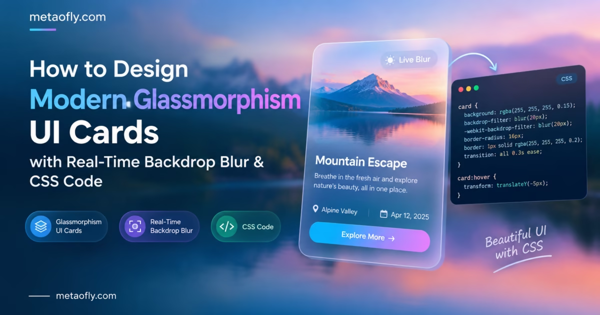
Editorial Technical Solution: Designing modern frosted glass user interface panels requires harmonizing three complex CSS properties: hardware-accelerated backdrop blur, semi-transparent surface fills, and directional light-reflecting border sheens. The ability to create glassmorphism css generator free assets gives front-end engineers and UI/UX designers an interactive visual laboratory to fine-tune blur radii and copy production-ready CSS with zero guesswork. MetaoFly Glassmorphism UI Studio renders real-time frosted glass components directly inside your browser with zero external dependencies.
Over the past decade of digital interface evolution, flat minimalist design has steadily given way to dimensional, tactile surface styling. Pioneered by Apple’s iOS blur trays and Microsoft’s Fluent Design Acrylic material, the glassmorphism design trend has established itself as the defining aesthetic of cutting-edge modern software. When executed with precision, translucent frosted glass panels establish an elegant multi-planar visual hierarchy, allowing vibrant background gradients to filter softly beneath elevated cards. However, hand-coding raw CSS values for optical blur, specular border highlights, and ambient shadow decay is notoriously tedious. Using an interactive tool to create glassmorphism css generator free styling allows creative teams to sculpt breathtaking frosted glass cards in seconds, complete with vendor prefixes and cross-browser fallbacks.
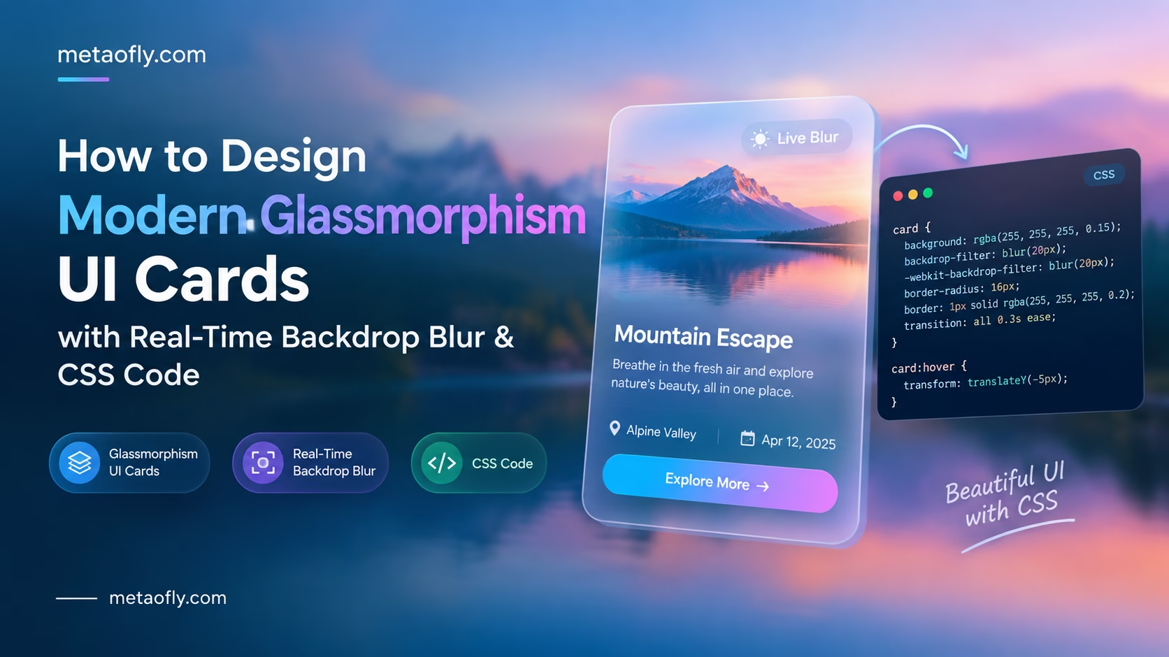
MetaoFly Glassmorphism UI Studio
Design translucent frosted glass panels, glowing cards, and modal sheets with real-time blur controls, specular border gradients, and 1-click CSS code export.
The Glassmorphism Aesthetic: From iOS and macOS Big Sur to Modern Web Interfaces
To understand why glassmorphism commands such intense visual appeal in contemporary web design, one must examine the psychological evolution of user interface metaphors. The early era of skeuomorphism (2007–2012) simulated literal physical materials—leather stitching, brushed brass, and glossy glass buttons with heavy inner bevels. The pendulum then swung violently toward flat design (2013–2019), stripping away all depth in favor of stark, unadorned solid color blocks.
While flat design solved mobile performance constraints, it introduced severe cognitive friction: interfaces felt sterile, and users struggled to distinguish clickable interactive elements from passive background content. Glassmorphism emerged as the sophisticated synthesis of both paradigms:
- Tactile Translucency Without Skeuomorphic Clutter: By simulating frosted, sandblasted optical glass rather than reflective mirrors, glassmorphism introduces organic physical depth without cluttering the screen with faux leather or wood grain textures.
- Spatial Context and Ambient Continuity: Because a frosted glass card reveals blurred glimpses of colors and shapes residing on underlying layers, the user maintains spatial awareness of where they reside within the application hierarchy. Background artwork, 3D elements, and decorative blobs peek through, enriching the viewing experience.
- Premium Futuristic Craftsmanship: Glassmorphic styling is strongly associated with high-end operating system hardware and luxury consumer tech platforms. Applying frosted glass treatments to SaaS pricing cards, cryptocurrency dashboards, and hero presentation banners immediately elevates perceived software value.
- Unified Light and Dark Adaptability: Frosted glass surfaces effortlessly adapt across light and dark display modes. By shifting the underlying alpha tint from translucent white to translucent obsidian, the same visual hierarchy persists naturally without redesigning card layouts.
The CSS Trifecta: backdrop-filter, Semi-Transparent RGBA, and Specular Border Sheens
Many junior developers attempt to create glassmorphism by simply adjusting the CSS opacity property on a card container. This results in an immediate visual failure: reducing container opacity causes all child text, icons, and buttons to become semi-transparent and illegible.
Authentic glassmorphism relies on a strict CSS architectural formula consisting of three synchronized properties:
1. Hardware-Accelerated Backdrop Blur (`backdrop-filter`)
Governed by the official MDN Web Docs backdrop-filter specification, this CSS property applies graphical blur effects strictly to the pixels located directly behind the element’s bounding box, while leaving the element’s own foreground content (text, icons, buttons) 100% opaque, crisp, and readable:
/* The Core Optical Engine */
-webkit-backdrop-filter: blur(16px);
backdrop-filter: blur(16px);
2. Semi-Transparent Surface Tint (Alpha-Channel RGBA Fill)
Pure optical glass requires a subtle color wash to define its physical presence against the background. In light themes, this is achieved with a high-transparency pure white fill: rgba(255, 255, 255, 0.15). In sleek dark modes, use a deep slate or midnight tint: rgba(15, 23, 42, 0.65). The alpha transparency percentage must be kept between 10% and 40%; higher values turn the glass into an opaque slab, while lower values cause the card boundary to vanish completely.
3. Directional Specular Border Sheen (`border: 1px solid`)
This is the secret ingredient that transforms a flat semi-transparent box into a breathtaking glass object. In the real world, cut glass sheets exhibit bright reflections along their beveled edges where external light catches the boundary. Applying a delicate 1px border with a semi-transparent white highlight (e.g., border: 1px solid rgba(255, 255, 255, 0.25)) or an angled CSS linear gradient border simulates overhead studio light bouncing off the glass rim.
| UI Design Style | Primary Depth Mechanism | Background Interaction | CSS Performance Impact | Best Applied For |
|---|---|---|---|---|
| Flat Minimalist Design | None (2D solid fills, 0px elevation) | Completely obscures underlying content | Zero GPU overhead (Extremely lightweight) | Documentation, data-heavy tables, legal pages |
| Neumorphism (Soft Extrusion) | Dual light/dark inner box-shadows | Monochromatic, matches background color | Low GPU overhead, but poor accessibility | Smart home dials, calculator buttons (Niche) |
| Glassmorphism (Frosted Glass) | Backdrop blur + alpha tint + border sheen | Translucent, refracts background ambient art | Moderate GPU compositing layer overhead | Hero cards, modal dialogs, SaaS pricing tiers, navbars |
| Brutalism (Hard Shadow) | Thick black solid borders, harsh offsets | High-contrast opaque blocking | Zero GPU overhead (Main thread raster) | Indie hacker sites, avant-garde portfolios, dev blogs |
| Claymorphism (3D Soft Puffy) | Thick outer drop shadows + inner glow | Floating 3D pillowy surface | Light GPU overhead, high CSS complexity | Web3 interfaces, onboarding cards, gamified apps |
Mathematical Foundations: How Web Browsers Render Backdrop Blur
To understand why hand-tuning blur values often leads to inconsistent rendering across different screens, one must explore the underlying graphics pipeline executed by the browser engine. When a browser encounters a backdrop-filter declaration, it does not simply blur an image file; it executes a mathematical convolution algorithm directly across the GPU’s frame buffer:
- The 2D Gaussian Kernel Function: True optical blurring is calculated using the Gaussian distribution bell curve formula:
G(x, y) = (1 / (2 * π * σ²)) * e^(-(x² + y²) / (2 * σ²)), whereσ(sigma) represents the standard deviation proportional to your CSS pixel blur radius. For a 16px blur radius, the browser must evaluate dozens of neighboring pixel coordinates to calculate the final color of every single pixel on screen. - Separable Two-Pass Optimization: Because calculating a 2D convolution matrix is computationally expensive, modern GPU shader engines break the calculation into two independent 1D passes: first a horizontal blur pass, followed immediately by a vertical blur pass. This mathematical separation reduces computational complexity from
O(r²)down toO(2r), enabling smooth rendering on modern desktop hardware. - Fresnel Reflection and Specular Angles: In physical optics, the Fresnel equations dictate that the reflectivity of a transparent dielectric surface increases dramatically at grazing viewing angles. While standard CSS cannot compute dynamic 3D ray tracing, web designers simulate Fresnel reflection by applying a subtle linear gradient to the card border: brighter white at the top-left edge where ambient ceiling light strikes the card, fading to near-invisible transparency along the bottom-right shadow edge.
Four Production-Grade Glassmorphism Color Recipes
Glassmorphism is not a monolithic single style; it adapts across diverse brand personalities. When you create glassmorphism css generator free designs in MetaoFly, you can quickly calibrate values across these four industry-standard production palettes:
Recipe 1: The Dark Cyberpunk Obsidian Glass
Ideal for developer tooling, cryptocurrency exchanges, and gaming platforms. When developers use MetaoFly to create glassmorphism css generator free presets for cyberpunk interfaces, they pair an obsidian slate base with an electric cyan or ultraviolet specular border highlight:
/* Cyberpunk Obsidian Glass */
.glass-cyberpunk {
  background: rgba(15, 23, 42, 0.72);
  -webkit-backdrop-filter: blur(20px);
  backdrop-filter: blur(20px);
  border: 1px solid rgba(56, 189, 248, 0.35);
  box-shadow: 0 20px 50px rgba(0, 0, 0, 0.6), inset 0 1px 0 rgba(255, 255, 255, 0.15);
  border-radius: 16px;
}
Recipe 2: The Nordic Minimalist Clean Frost
Tailored for luxury e-commerce, architectural studios, and editorial publications. Emphasizes bright airy translucency with subtle warmth:
/* Nordic Minimalist Frost */
.glass-nordic {
  background: rgba(255, 255, 255, 0.22);
  -webkit-backdrop-filter: blur(14px);
  backdrop-filter: blur(14px);
  border: 1px solid rgba(255, 255, 255, 0.45);
  box-shadow: 0 15px 35px rgba(0, 0, 0, 0.06);
  border-radius: 20px;
}
Recipe 3: The Warm Fintech Sunset Amber Glass
Designed for wealth management apps, venture capital landing pages, and luxury financial portfolios. Imbues translucent glass with warm golden undertones:
/* Fintech Sunset Amber */
.glass-amber {
  background: rgba(30, 27, 75, 0.65);
  -webkit-backdrop-filter: blur(18px);
  backdrop-filter: blur(18px);
  border: 1px solid rgba(251, 191, 36, 0.25);
  box-shadow: 0 25px 50px rgba(0, 0, 0, 0.4), 0 0 20px rgba(245, 158, 11, 0.1);
  border-radius: 18px;
}
Recipe 4: The Sticky Floating Glass Navigation Bar
The classic modern SaaS header bar that floats fixed at the top of the viewport. As users scroll through content, rich page typography and graphics slide beneath the navigation bar, diffusing into an elegant ambient wash:
/* Sticky Floating Glass Navbar */
.glass-navbar {
  position: sticky;
  top: 1rem;
  z-index: 100;
  background: rgba(15, 23, 42, 0.8);
  -webkit-backdrop-filter: blur(12px);
  backdrop-filter: blur(12px);
  border: 1px solid rgba(148, 163, 184, 0.15);
  border-radius: 9999px;
  box-shadow: 0 10px 30px rgba(0, 0, 0, 0.25);
}
Step-by-Step Blueprint: Using a Tool to Create Glassmorphism CSS Generator Free Styling
Sculpting production-ready frosted glass components requires zero guesswork when leveraging MetaoFly’s visual studio. By utilizing this interactive environment to create glassmorphism css generator free assets, creative teams can preview exact optical behaviors in real time. Follow this structured production blueprint:
Step 1: Open MetaoFly Glassmorphism UI Studio
Navigate to MetaoFly Glassmorphism UI Studio. The studio loads instantly in your desktop browser tab with zero account registrations or software downloads. All calculations, color conversions, and CSS rule assemblies occur 100% locally within your browser client.
Step 2: Calibrate the Backdrop Blur Radius
Adjust the Blur Slider between 8px and 32px based on your component hierarchy:
- Subtle Frost (8px – 12px): Ideal for navigation header bars where you want underlying web text to remain partially discernible as it scrolls beneath the bar.
- Balanced Medium Frost (16px – 20px): The universal sweet spot for UI cards, feature grids, and pricing tables. Completely diffuses background shapes into soft ambient color clouds while maintaining razor-sharp foreground readability.
- Heavy Frosted Acrylic (24px – 32px): Recommended for high-priority modal dialog overlays and authentication drawers where complete visual isolation from the page background is required.
Step 3: Fine-Tune Surface Translucency and Color Temperature
Use the color picker and alpha slider to match your brand palette:
- For clean light themes, configure a white base with 15% to 25% opacity:
rgba(255, 255, 255, 0.2). - For futuristic dark modes, configure deep midnight slate with 50% to 70% opacity:
rgba(15, 23, 42, 0.6). - For branded artistic cards, introduce a 5% to 10% tint of your brand accent (such as subtle violet
rgba(168, 85, 247, 0.08)) to infuse the glass with harmonious brand resonance.
Step 4: Sculpt the Directional Specular Border Sheen
Enable the “Specular Edge Highlight” option. Configure a 1px border with a delicate white alpha gradient (simulating light striking the card from the top-left at a 135-degree angle). This crisp highlight separates the frosted panel from complex underlying imagery.
Step 5: Layer Multi-Tier Ambient Drop Shadows
Configure an atmospheric drop shadow beneath the glass panel. In MetaoFly, layer a tight contact shadow (0 4px 6px -1px rgba(0, 0, 0, 0.1)) with an expansive ambient blur (0 20px 25px -5px rgba(0, 0, 0, 0.2)) to float the glass panel realistically above the canvas.
Step 6: Copy 1-Click Production CSS & Tailwind Code
Click the “Copy CSS” button to copy clean, formatted, vendor-prefixed code ready for immediate pasting into your stylesheet:
/* Production-Ready Glassmorphism Card CSS */
.glass-panel {
  background: rgba(15, 23, 42, 0.65);
  -webkit-backdrop-filter: blur(16px);
  backdrop-filter: blur(16px);
  border: 1px solid rgba(255, 255, 255, 0.18);
  border-radius: 16px;
  box-shadow: 0 20px 40px rgba(0, 0, 0, 0.35);
}
Key Technical Takeaways
- Always apply backdrop-filter with both standard and -webkit- prefixed syntax for full Safari support.
- Never reduce container opacity; use semi-transparent RGBA background fills to keep child text 100% opaque.
- A 1px semi-transparent specular border sheen is essential to define glass edges against complex backgrounds.
- Combine medium blur (16px) with 60% dark slate fills to guarantee full WCAG 2.1 AA text contrast.
Pro Engineering Tip: The Safari WebKit Prefix Requirement
A common front-end development mistake is declaring backdrop-filter without its vendor prefix. Safari on iOS and macOS will completely ignore un-prefixed backdrop-filter rules, leaving your glass cards rendering as flat, un-blurred transparent boxes. Always include -webkit-backdrop-filter first in your rule block.
Content Legibility and Contrast: Avoiding Low-Readability Frosted Glass Traps
While glassmorphism is undeniably stunning, improper execution can severely impair text legibility. When frosted panels rest over busy, high-contrast background imagery (such as high-contrast product photos or geometric grid lines), text can become difficult to read. When designers decide to create glassmorphism css generator free components for client-facing software, accessibility must remain paramount.
To guarantee flawless legibility that passes strict accessibility audits:
- Enforce Minimum Surface Opacity: Never drop your surface background fill below 50% opacity in dark mode or 20% in light mode if the card contains essential body copy or form inputs.
- Pair with High-Contrast Typography: Ensure your typography color achieves at least a 4.5:1 contrast ratio against the average luminance of the blurred surface. In dark mode, pair frosted midnight slate panels (#0f172a with 65% opacity) with pure white (#ffffff) or brilliant platinum (#f8fafc) typography.
- Add Subtle Text Drop Shadows: When placing white headings over variable frosted glass, apply an ultra-subtle text shadow:
text-shadow: 0 1px 2px rgba(0, 0, 0, 0.4);. This micro-shadow creates an imperceptible boundary that keeps letterforms sharp even if a bright background shape scrolls beneath the card. - Isolate Stacking Contexts with isolation: isolate: When layering multiple translucent cards, apply
isolation: isolate;to each container. This prevents CSS z-index bleeding and ensures that browser painting engines do not blend inner text elements with adjacent sibling background layers.
Common CSS Glassmorphism Bugs and Troubleshooting Solutions
Deploying glassmorphism across diverse production web applications often uncovers subtle rendering quirks. Here is how to diagnose and resolve the most common issues:
- The Safari Grey Box Glitch: In certain WebKit versions, elements styled with
backdrop-filterandborder-radiusrender with square grey artifacts along the rounded corners. To resolve this glitch, add-webkit-mask-image: -webkit-radial-gradient(white, black);to force WebKit to respect the corner curvature clip path. - Subpixel Font Blur on Windows ClearType Displays: When
transform: translateZ(0)is applied to trigger GPU compositing on non-retina displays, Windows font rasterization may disable ClearType subpixel font smoothing, causing body text to appear slightly blurry. Fix this by declaring-webkit-font-smoothing: subpixel-antialiased;or restricting GPU layer promotion to retina display media queries. - Z-Index Stacking Anomalies with Fixed Modals: Because
backdrop-filterinherently creates a new CSS stacking context (identical toopacity: 0.99ortransform: scale(1)), child elements inside a glass panel cannot escape to sit behind external elements. Always position modal overlay backgrounds and modal card panels as sibling DOM nodes rather than parent-child containers. - Overflow Hidden Clipping Edge Blurs: If your glass card contains animated child blobs or glowing lights, declaring
overflow: hidden;can inadvertently clip the outer halo of your drop shadows. Separate your visual container into an outer wrapper for drop shadows and an inner clipped container for backdrop filtering.
Cross-Tool Workflows: Pairing Glass Panels with Mockup Frames and Color Swatches
Glassmorphism reaches its full creative potential when integrated into an end-to-end design system workflow:
To select the ideal frosted surface tint and specular border colors for your glass cards, use the MetaoFly Color Palette & Contrast Extractor. Extract dominant tones from your brand imagery, test luminance contrast against pure white, and feed those exact RGBA coordinates directly into your glassmorphism CSS variables.
When presenting your finished glassmorphic UI components in client pitch decks or portfolio case studies, import screenshots of your live cards into the MetaoFly Device Screen Mockup Studio. Framing your frosted glass interfaces inside photorealistic 4K MacBook and iPhone hardware frames highlights the depth of your design system with executive elegance.
Fallback Strategies for Legacy Browsers: Progressive Enhancement with CSS supports
While modern desktop and mobile browsers maintain near-universal support for backdrop-filter, older corporate browser releases or devices running low-power battery-saver modes may disable hardware-accelerated filtering. To guarantee a graceful fallback experience, implement progressive enhancement using the CSS @supports feature query:
/* Default Solid Fallback for Legacy Browsers */
.glass-panel {
  background: #1e293b; /* Opaque slate fallback */
  border: 1px solid #334155;
  border-radius: 16px;
  box-shadow: 0 10px 25px rgba(0, 0, 0, 0.3);
}

/* Progressive Enhancement for Modern Browsers */
@supports ((-webkit-backdrop-filter: blur(1px)) or (backdrop-filter: blur(1px))) {
  .glass-panel {
    background: rgba(15, 23, 42, 0.65);
    -webkit-backdrop-filter: blur(16px);
    backdrop-filter: blur(16px);
    border: 1px solid rgba(255, 255, 255, 0.18);
  }
}
With this architecture, legacy browsers display a crisp, accessible opaque slate card, while modern hardware automatically activates the luxurious frosted glass optical pipeline.
Design Your Frosted Glass UI in Seconds
Create modern glassmorphism cards, panels, and navigation bars with interactive blur sliders, specular border sheens, and 1-click CSS code export. 100% free with zero downloads.