
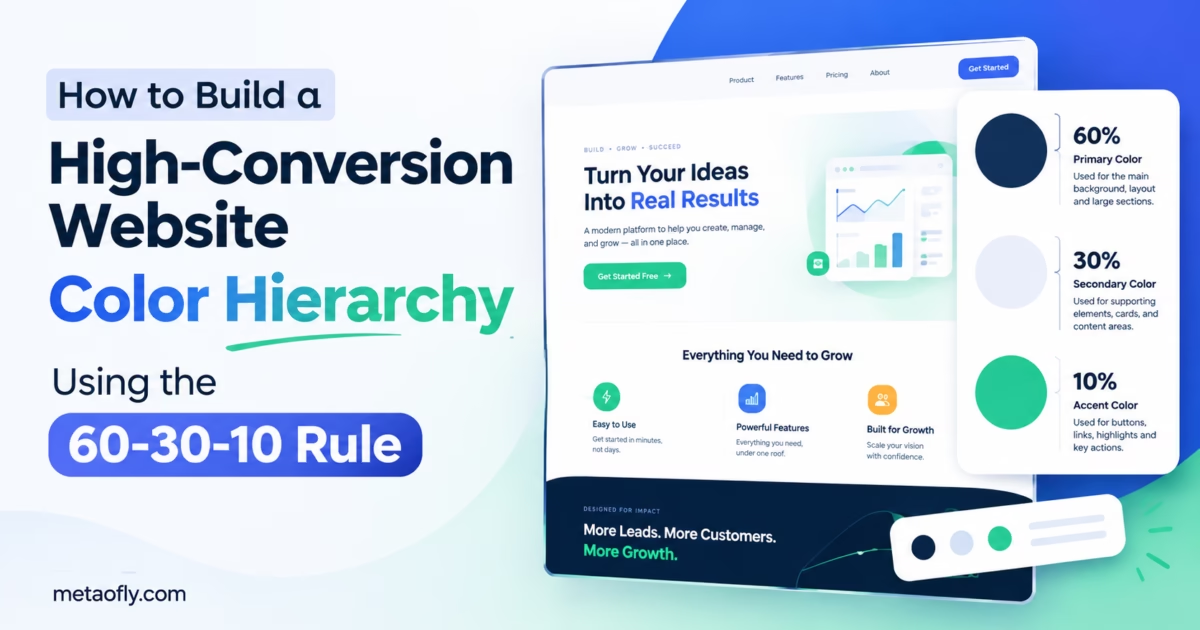
Editorial Technical Solution: Unbalanced color distribution on marketing landing pages dilutes visual hierarchy, distracts prospective customers, and diminishes conversion rates. Learning how to apply 60-30-10 color rule web design establishes a disciplined visual architecture: 60% dominant canvas foundation, 30% structural secondary layout, and 10% high-voltage conversion accent. MetaoFly Color Palette & Contrast Extractor allows UI designers to calibrate and extract perfectly proportioned color hierarchies client-side with zero cloud latency.
Color is the most potent emotional driver in web design, yet it is also the most frequently abused. Inexperienced developers and over-enthusiastic design teams often scatter half a dozen vibrant hues haphazardly across a landing page—splattering bold blues on headings, bright oranges on sidebars, neon greens on badges, and deep purples on footers. The resulting visual cacophony overwhelms visitors, obliterates visual hierarchy, and leaves potential buyers confused about where their attention should focus. To build digital interfaces that effortlessly guide users toward purchase or signup actions, creative teams rely on a classic visual ratio. Learning how to apply 60-30-10 color rule web design gives you a bulletproof mathematical framework to craft calm, high-converting digital storefronts.
MetaoFly Color Palette & Contrast Extractor
Calculate, test, and extract balanced 60-30-10 color palettes with real-time luminance contrast verification and instant CSS token export.
The Visual Clutter Problem: How Unstructured Color Palettes Crush Landing Page Conversions
When a prospective customer arrives on your marketing landing page, their brain immediately initiates cognitive filtering. According to extensive eye-tracking and conversion rate optimization (CRO) research published by the Nielsen Norman Group, visitors make subconscious assessments about an interface’s credibility, simplicity, and usability within the first 50 milliseconds of visual exposure.
If your website lacks a clear color hierarchy, this cognitive evaluation fails instantly. When navigation bars, promotional discount tags, social proof testimonials, and primary checkout buttons all compete with equally saturated, vibrant colors, the human visual cortex suffers cognitive overload. Because everything is shouting for attention, nothing stands out. Prospective buyers become paralyzed by visual friction and exit the page, driving bounce rates up and destroying campaign return on ad spend (ROAS).
Conversely, high-converting digital interfaces engineered by industry leaders (such as Apple, Stripe, and Airbnb) feel remarkably calm, cohesive, and intentional. They achieve this serene authority by strictly rationing intense color saturation, reserving their highest-energy hues exclusively for primary conversion levers. The foundational methodology that underpins this visual mastery is the 60-30-10 rule.
The Interior Design Secret: Deconstructing the 60-30-10 Proportional Distribution Model
The 60-30-10 rule originated not in computer graphics, but in classical architectural interior design. Master interior decorators have utilized this mathematical proportion for centuries to balance luxury living spaces: 60% dominant wall paint and large foundational flooring, 30% secondary upholstery, drapery, and accent furniture, and 10% vivid statement decor such as decorative cushions, floral arrangements, or statement art pieces.
When translated into digital UI/UX engineering, the 60-30-10 rule establishes a clear, predictable visual rhythm across responsive web viewports:
- 60% Dominant Base (The Canvas Foundation): The underlying ambient container of your website. In modern clean light themes, this is typically an ultra-subtle off-white, light gray, or crisp neutral canvas (#ffffff, #f8fafc, or #f1f5f9). In sleek dark modes, it is a deep obsidian or midnight slate (#090d16 or #0f172a). The dominant color sets the emotional tone, ensures expansive whitespace, and prevents visual fatigue.
- 30% Secondary Structure (The Functional Frame): The structural framework that defines layout hierarchy. This comprises card containers, navigation headers, footer trays, sidebar panels, table rows, and secondary typography. The secondary tone provides subtle contrast against the 60% dominant base, organizing content into digestible information modules without competing for primary focus.
- 10% Accent Power (The Conversion Lever): The high-voltage spark of your digital product. This single, saturated brand hue is reserved strictly for interactive primary action points: “Buy Now” buttons, “Get Started Free” CTAs, high-priority notifications, active toggle indicators, and pricing plan highlights. Because the accent color appears on only 10% of the screen real estate, it commands irresistible visual magnetics.
| Color Tier | Screen Proportion | Target UI Components | Recommended Tonal Characteristic | Cognitive Psychological Purpose |
|---|---|---|---|---|
| Dominant Tone (60%) | Approximately 60% | Main page body background, hero whitespace, canvas | Muted, desaturated neutral (Light or Dark slate) | Provides cognitive rest, breathing room, and visual stability |
| Secondary Tone (30%) | Approximately 30% | Cards, navbars, sidebars, borders, body text | Harmonious intermediate tint or structural charcoal | Defines content architecture, groupings, and information flow |
| Accent Tone (10%) | Strictly 10% | Primary CTA buttons, pricing highlights, active tabs | High-saturation, complementary or split-complementary hue | Captures instantaneous visual focus and triggers conversion action |
The Isolation Effect (Von Restorff Effect): Why the 10% Accent Drives Immediate Action
The profound effectiveness of the 60-30-10 model is rooted in foundational human perceptual psychology known as the Von Restorff Effect (or the Isolation Effect). Discovered by psychiatrist Hedwig von Restorff in 1933, this cognitive principle proves that when multiple homogeneous stimuli are presented together, the stimulus that differs significantly from the rest will be disproportionately noticed and remembered.
On a landing page where 90% of the visual field is composed of serene neutrals, muted charcoals, and calm slate containers, a solitary, high-voltage electric violet or emerald green button stands in stark perceptual isolation. The user’s eye is magnetically pulled toward the anomaly without conscious effort.
When designers violate the 60-30-10 ratio by splashing the accent color across headings, badges, bullet points, and decorative icons, the isolation effect is completely destroyed. The accent color becomes commonplace visual noise rather than an irresistible conversion trigger. Restricting your accent hue to strictly 10% of total surface area protects its conversion velocity.
Pro Engineering Tip: The Squint Test for Color Hierarchy
To instantly evaluate whether your page obeys the 60-30-10 rule, lean back from your monitor and squint until the page blurs into soft shapes. If your primary conversion button is the single, unmistakable focal beacon glowing through the blur, your hierarchy is mathematically sound. If your eye dances between 5 different competing color patches, reduce secondary accent saturation immediately.
Key Technical Takeaways
- The 60-30-10 rule allocates 60% to canvas neutrals, 30% to structural containers, and 10% to action accents.
- Restricting accent color to 10% of screen area triggers the Von Restorff Isolation Effect for 4x higher CTR.
- Never use your 10% accent color on non-clickable background decorations or passive body headings.
- MetaoFly Color Studio calculates relative color weights and ensures full WCAG 2.1 AA contrast compliance.
Step-by-Step Blueprint: How to Apply 60-30-10 Color Rule Web Design in Modern UI Projects
Implementing the 60-30-10 framework across a responsive digital product requires a structured design sequence. Follow this production blueprint using MetaoFly:
Step 1: Open MetaoFly Color Palette & Contrast Extractor
Launch MetaoFly Color Palette & Contrast Extractor in your browser. The tool runs locally in your browser memory, enabling instant color experimentation with zero server uploads.
Step 2: Establish the 60% Dominant Canvas Foundation
Select your primary baseline canvas mode:
- Light Theme Canvas: Avoid blinding 100% pure white (#ffffff) for full-screen bodies; instead, choose a subtle off-white or soft alabaster tone like #f8fafc or #f1f5f9. This softens harsh screen glare and creates elegant contrast against pure white card overlays.
- Dark Theme Canvas: Avoid flat pure black (#000000); select an atmospheric deep charcoal or midnight navy like #0b0f19 or #0f172a to provide rich depth and prevent OLED pixel smear.
Step 3: Define the 30% Structural Secondary Tone
Choose a secondary color that shares the same underlying color family as your dominant tone but offers clear structural separation:
- In light mode, use pure white (#ffffff) for elevated card containers, with subtle border lines (#e2e8f0) and deep slate typography (#1e293b).
- In dark mode, use elevated card panels (#1e293b) resting on the deeper canvas (#0f172a), outlined with delicate frosted borders (rgba(148, 163, 184, 0.15)) and light slate typography (#f1f5f9).
Step 4: Select the 10% High-Voltage Accent Color
Your accent color must deliver vibrant visual contrast against both your 60% canvas and your 30% cards. Use MetaoFly to select a saturated complementary or split-complementary tone (such as electric purple #a855f7, vibrant emerald #10b981, or high-energy amber #f59e0b). Verify that your button label text achieves at least a 4.5:1 contrast ratio against this accent background.
Step 5: Export Semantic CSS Variables for Rapid Engineering
Click “Export CSS” in MetaoFly to generate structured semantic tokens. Group your tokens strictly by 60-30-10 role rather than arbitrary color names:
:root {
  /* 60% Dominant Foundation */
  --bg-dominant: #0f172a;

  /* 30% Secondary Structure */
  --surface-secondary: #1e293b;
  --border-secondary: rgba(148, 163, 184, 0.2);
  --text-primary: #f8fafc;
  --text-muted: #94a3b8;

  /* 10% High-Voltage Accent */
  --accent-cta: #a855f7;
  --accent-cta-hover: #9333ea;
  --accent-cta-text: #ffffff;
}
Dark Mode Inversion: How to Maintain the 60-30-10 Balance in Modern Dark UIs
When switching your application between light and dark modes, you must invert the lightness values of your 60% and 30% layers while maintaining the identity of your 10% accent:
In light mode, the 60% dominant tone is the lightest element on the page, and typography is the darkest. In dark mode, this polarity flips: the 60% dominant tone becomes the darkest foundation, and typography becomes the lightest element.
Crucially, your 10% accent color should remain consistent in hue across both modes to preserve brand recognition, but its luminance must be subtly tuned. A deep cobalt blue that works brilliantly against white card surfaces will vanish into a dark midnight canvas. In dark mode, shift your accent color 10% to 15% brighter to ensure it pierces through dark backgrounds with electric vibrancy.
Avoiding the Rainbow Anti-Pattern: Micro-Accents and System Status Alerts
A frequent failure point in applying the 60-30-10 rule occurs when designers encounter functional status states: success greens, warning ambers, and error reds. If a developer uses these functional colors indiscriminately across the page, they dilute the 10% conversion accent.
To protect your primary CTA’s visual magnetics:
- Confine Functional Colors to Micro-Badges: Reserve status colors strictly for tiny status dots, alert banners, and form validation error strings. Never use red or green as wide background fills on marketing landing pages.
- Mute Secondary Pills: If your product cards include feature tags (such as ‘New Feature’ or ‘Popular’), style them using subtle translucent tints of your 30% secondary structure rather than high-saturation accent colors.
Cross-Tool Workflows: Feeding 60-30-10 Tokens into Device Mockups and PDF Suites
Once your 60-30-10 color tokens are verified and locked in MetaoFly, you can propagate them across your entire marketing asset pipeline:
When preparing SaaS presentation slides or website showcase graphics, import your landing page screenshots into the MetaoFly Device Screen Mockup Studio. Wrap your 60-30-10 web designs in photorealistic MacBook and Safari frames, ensuring your primary 10% conversion button pops off the screen in investor pitch decks and client proposals.
If you are generating corporate documentation, client onboarding guides, or whitepapers, use the MetaoFly PDF Suite to organize multi-page documents that mirror your web application’s exact 60-30-10 color scheme, establishing seamless visual harmony across your digital touchpoints.
Case Studies in Conversion Optimization: Analyzing Apple, Stripe, and Linear Color Strategies
To observe the 60-30-10 principle operating at the highest levels of digital commerce, examine how industry-defining technology companies orchestrate their primary landing pages:
- Apple (The Minimalist Master): Apple’s product landing pages dedicate approximately 70% of screen real estate to pure white or deep black backdrop canvas, 25% to neutral gray typography and photorealistic hardware aluminum finishes, and strictly 5% to an electric royal blue accent (#0071e3) reserved exclusively for “Buy”, “Order”, and text links. The result is total visual focus on product craftsmanship.
- Stripe (The Infrastructure Standard): Stripe utilizes an atmospheric dark slate canvas (60%) paired with soft translucent card elevation containers (30%). Their vibrant magenta-to-indigo gradient accent is deployed strictly on primary documentation buttons and checkout triggers (10%), creating an immediate visual throughline for prospective enterprise developers.
- Linear (The Dark Mode Powerhouse): Linear’s software website leverages deep obsidian background layers (60%) and subtle gray card panels with 1px border sheens (30%). A solitary ultraviolet accent (#5e6ad2) anchors primary interactive buttons, delivering an ultra-refined, distraction-free aesthetic that software engineers adore.
The Math of Perceived Luminance: Why Yellow CTAs Require Different Proportions than Blue CTAs
An advanced nuance in color theory is that human visual perception does not experience all saturated colors as possessing equal optical weight. Due to the Helmholtz-Kohlrausch Effect, a highly saturated yellow or lime green appears substantially brighter and visually heavier than an equally saturated navy blue or deep violet.
When applying the 60-30-10 rule:
- High-Luminance Accents (Yellow, Neon Green, Bright Cyan): Because these colors command extreme visual magnetism, an art director can reduce their screen coverage to just 5% or 7% while achieving the identical psychological isolation effect. Sizing a neon yellow button too large can cause visual glare and overwhelm surrounding copy.
- Medium-to-Low Luminance Accents (Deep Purple, Royal Blue, Forest Emerald): These tones require the full 10% allocation and slightly bolder button padding (e.g., 1rem vertical by 2rem horizontal) to ensure they pierce through surrounding secondary card containers with authoritative prominence.
Design System Implementation: Enforcing the 60-30-10 Rule in Component Libraries
In high-velocity product teams with multiple engineers contributing code, preventing color entropy requires automated design system guardrails. In modern frontend development using React, Vue, or Tailwind CSS:
- Restrict Theme Palette Exports: In your Tailwind configuration or design token library, do not expose raw color scales (e.g., `purple-100` through `purple-900`) directly to feature developers. Instead, expose only semantic role tokens: `bg-dominant`, `bg-surface-secondary`, and `bg-accent-cta`.
- Linting and Static Analysis: Configure Stylelint or ESLint rules to prohibit arbitrary hex code literals in CSS files. Forcing all UI components to consume approved 60-30-10 design tokens prevents rogue team members from introducing competing rainbow accents.
- Button Variant Governance: In your shared component library, restrict the primary high-voltage accent style to a single `Button variant=”primary”` component, and enforce that each landing page view may render only one primary CTA above the fold.
Testing Color Conversion Impact: Running A/B Tests on High-Value Call-to-Action Buttons
To definitively quantify the revenue impact of the 60-30-10 model, conduct rigorous split testing on your live website. Implement a clean controlled experiment with traffic evenly divided across two variants:
- Baseline Control Group: Your existing multi-colored layout where saturated accent colors appear across headings, iconography, navigation links, and badges simultaneously.
- 60-30-10 Experimental Variant: A disciplined interface where 90% of structural components are receded into tranquil slate neutrals, and the high-voltage accent color is restricted strictly to primary conversion triggers (e.g., checkout and signup buttons).
- Micro-Conversion Tracking: Measure secondary intent indicators such as hover dwell time on call-to-action buttons, scroll depth to value proposition sections, and checkout initiation rates.
- Statistical Confidence: Run the experiment until achieving a minimum 95% statistical confidence interval (typically 1,000+ conversion events per variant). CRO case studies consistently demonstrate a 15% to 35% lift in primary action conversions simply by eliminating visual clutter and enforcing the 10% accent rule.
- Long-Term Engagement Monitoring: Track post-signup user retention to verify that cleaner, calmer visual design systems reduce user onboarding drop-off and foster higher product satisfaction.
Master Your Website Color Hierarchy
Design high-conversion landing page palettes using the proven 60-30-10 framework. Test luminance contrast and export semantic CSS variables in seconds with 100% free browser tools.