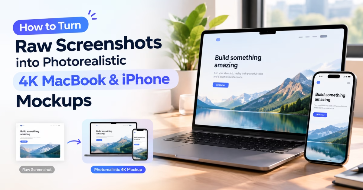

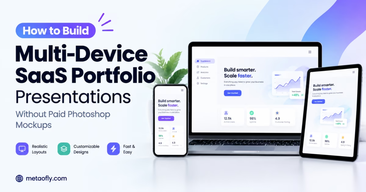
Editorial Technical Solution: Demonstrating responsive software architecture across simultaneous desktop, tablet, and mobile form factors is essential for winning client contracts and pitching venture capital investors. Utilizing a modern multi device screen mockup generator free eliminates the tedious friction of heavy Photoshop PSD smart objects and expensive monthly mockup subscriptions. MetaoFly Device Screen Mockup Studio delivers multi-frame responsive staging directly inside your browser tab with hardware-accelerated 4K export and zero server uploads.
Modern digital products do not live inside a single screen container. Enterprise clients, startup founders, and design team leads evaluate software based on how cohesively its user experience translates across an interconnected multi-device ecosystem—from widescreen desktop workstations and lightweight tablets to mobile smartphone touchscreens. However, building multi-device portfolio presentations has historically been an agonizing, resource-intensive chore requiring massive multi-gigabyte Adobe Photoshop PSD templates with sluggish smart objects. Embracing a modern multi device screen mockup generator free empowers creative professionals to assemble breathtaking, multi-device ecosystem showcases in seconds directly inside their web browser, completely free of charge.
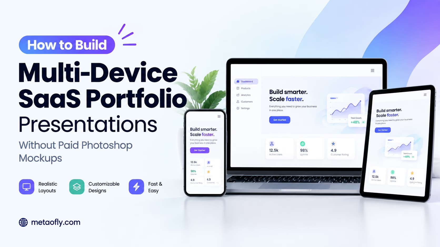
MetaoFly Device Screen Mockup Studio
Build responsive multi-device showcases featuring MacBook, iPad, iPhone, and Safari browser frames with independent per-screen crop controls and 4K export.
The Multi-Device Showcase Dilemma: Why Clients Demand Ecosystem Presentations
When pitching digital design concepts or presenting a finished SaaS product to executive stakeholders, presenting a solitary desktop screenshot is no longer sufficient. Enterprise buyers and product executives evaluate software through the lens of omnichannel operational continuity:
- Proving Mobile-First Usability: Over 60% of modern software interactions originate on mobile devices. A multi-device presentation immediately reassures decision-makers that the software features full mobile functionality rather than a compromised afterthought.
- Communicating Comprehensive Scope: Showcasing an interconnected composition—where a master dashboard on a MacBook Pro is flanked by an executive summary on an iPad and quick-action notifications on an iPhone—instantly conveys enterprise-grade product depth and structural maturity.
- Elevating Creative Portfolio Distinction: On design showcase platforms like Dribbble, Behance, and personal portfolio sites, multi-device hero graphics capture 3x more visual engagement than single-device snapshots, establishing the designer as an expert in complex responsive systems.
Breaking Free from Bloated PSD Smart Objects and Subscription SaaS Paywalls
For over fifteen years, the standard industry method for creating multi-device portfolio presentations involved downloading commercial Photoshop PSD mockup templates. While capable of producing quality renders, the PSD workflow is plagued by severe technical overhead:
Catastrophic File Sizes: A comprehensive multi-device PSD template frequently weighs between 1.5GB and 3.5GB. Downloading, unzipping, and opening these gargantuan files consumes massive local disk space and overwhelms computer RAM, causing Photoshop to stutter and beachball on all but the most expensive workstations.
Smart Object Friction: To populate a three-device composition in Photoshop, a designer must double-click into three separate embedded `.psb` smart object files, paste screen grabs, adjust scaling, save each smart object, wait for rasterization updates, and return to the master composition. If a client requests a minor UI color adjustment, the entire multi-step smart object cycle must be repeated from scratch.
Subscription Paywalls and Vendor Lock-in: Cloud-based mockup services emerged to solve this friction, but they quickly erected predatory paywalls—charging designers $25 to $50 per month just to export clean, watermark-free images. For freelance creators and early-stage startup teams, recurring mockup subscriptions represent an unnecessary operational tax.
MetaoFly Device Screen Mockup Studio completely eliminates these barriers by running an ultra-fast, zero-overhead multi-device engine directly inside your browser. No 3GB file downloads, no smart object lag, no monthly subscriptions, and zero cloud uploads.
| Workflow Criteria | Traditional Photoshop PSD Template | Generic Subscription SaaS Mockup Tool | MetaoFly Multi-Device Studio |
|---|---|---|---|
| Initial Asset Download | 1.5GB – 3.5GB heavy archive | None (Cloud based) | Instant (0 MB download, browser-native) |
| Hardware RAM Overhead | 4GB – 12GB RAM consumption | Moderate browser memory | Ultra-lightweight HTML5 Canvas pipeline |
| Multi-Screen Insertion | Tedious nested smart object editing | Sequential server upload queues | Simultaneous drag-and-drop into all frames |
| Export Resolution | High (but slow render time) | Capped at 1080p on free tiers | Full 4K Ultra-HD (3840×2160) Instant Export |
| Cost Structure | $20-$50/mo Adobe CC + template fees | $29-$49/mo recurring subscription | 100% Free Browser Studio with zero paywalls |
| Data Privacy & NDAs | Local (Secure) | Uploaded to third-party cloud servers | 100% Private (Processed purely in local RAM) |
Multi-Device Responsive Breakpoints: Mapping Fluid Layouts Across Viewport Widths
A high-converting multi-device showcase depends fundamentally on capturing your web application at the correct standard responsive breakpoints. In modern CSS frontend engineering, responsive design is governed by media query breakpoints defined in the W3C CSS Fragmentation and Layout Specifications:
- Widescreen Desktop (1920×1080 / 1440×900 px): Showcases your complete navigational information architecture: expanded multi-column data tables, full sidebar navigation, multi-metric KPI charts, and secondary action drawers.
- Adaptive Tablet Breakpoint (1024×768 / 1180×820 px): Demonstrates how your layout gracefully responds to medium viewports: sidebars collapse into icon rails, four-column dashboard grids adapt into balanced two-by-two modules, and touch targets expand for fingertip precision.
- Mobile Smartphone Viewport (390×844 / 412×915 px): Highlights extreme mobile ergonomics: sticky bottom action bars, collapsible hamburger navigation drawers, horizontal touch-swipe card carousels, and thumb-friendly checkout buttons.
When these three viewport captures are harmonized inside MetaoFly’s multi-device canvas, prospective clients can instantly verify that your software offers full feature parity and operational elegance across the entire hardware continuum.
The Art of Visual Hierarchy in Multi-Screen Compositions: Guiding the Stakeholder Eye
Arranging three disparate hardware frames into a single compelling marketing image requires deliberate composition mechanics. If all three devices are rendered at identical visual scales, they fight for visual dominance, creating confusion.
Master portfolio artists utilize proportional scaling and depth staggering:
Primary Anchor (MacBook Desktop): Positioned centrally as the visual foundation, occupying approximately 65% of the horizontal canvas width. The laptop frame establishes the macro scope of the software application.
Secondary Anchor (iPad Tablet): Flanked to the left, angled or overlapping the laptop chassis by 15% to 20%. The tablet displays an intermediate analytical view, bridging desktop complexity and mobile simplicity.
Focal Anchor (iPhone Mobile): Positioned in the foreground right, scaled slightly larger relative to its physical real-world size to command immediate punch. Because smartphones represent the personal device closest to human daily life, the viewer’s eye naturally gravitates toward the mobile interface to inspect micro-interaction details.
Step-by-Step Blueprint: Using a Multi Device Screen Mockup Generator Free to Build Ecosystem Showcases
Assembling a master-grade multi-device SaaS portfolio presentation takes under 90 seconds using MetaoFly. Follow this structured blueprint:
Step 1: Capture Cohesive Responsive Screenshots
Before opening the mockup studio, capture coordinated screenshots of your application across its three primary responsive breakpoints:
- Desktop View (MacBook / Safari): Capture the full desktop dashboard or landing page hero section at 1920×1080 or high-DPI 2880×1800 resolution.
- Tablet View (iPad / Tablet Frame): Capture the responsive medium breakpoint (typically around 1024px to 1366px width) showcasing sidebar collapsing or adaptive two-column grids.
- Mobile View (iPhone / Smartphone Frame): Capture the mobile-optimized vertical viewport (390px to 430px width) displaying stacked cards, bottom navigation trays, or quick-action sheets.
Step 2: Launch MetaoFly Device Screen Mockup Studio
Open MetaoFly Device Screen Mockup Studio. Select the “Multi-Device Ecosystem” layout preset from the composition menu.
Step 3: Ingest Screenshots into Dedicated Device Slots
Drag and drop each captured image into its corresponding hardware target slot:
- Slot 1 (Central Background): Assign your desktop MacBook Pro or Safari browser window.
- Slot 2 (Foreground Left): Assign your iPad / tablet device frame.
- Slot 3 (Foreground Right): Assign your iPhone mobile device frame.
MetaoFly independently manages the aspect ratio and coordinate alignment of each screen grab, ensuring that mobile assets are not warped into desktop frames and vice versa.
Step 4: Harmonize Spatial Depth, Overlaps, and Shadow Elevations
Adjust the multi-device staging controls:
- Layer Stacking Order: Position the mobile phone and tablet slightly in front of the laptop chassis to create natural visual depth and visual hierarchy.
- Inter-Device Cast Shadows: MetaoFly automatically projects subtle cast shadows from foreground devices onto the background laptop screen, creating genuine spatial realism.
- Per-Screen Focal Zoom: Fine-tune the pan and zoom alignment within each individual device screen to highlight critical interface details.
Step 5: Export High-Resolution 4K Assets for Portfolio Deployment
Choose your export target: transparent PNG for flexible placement over website stylesheets, or high-density JPG with an atmospheric studio background for direct upload to Behance, Dribbble, or slide decks. Click export to download your pristine, multi-device graphic in seconds.
Key Technical Takeaways
- Multi-device ecosystem mockups prove mobile-first responsiveness and elevate perceived SaaS value.
- Browser-based multi-frame rendering eliminates 3GB Photoshop PSD downloads and smart object lag.
- Independent per-screen crop controls prevent distorted aspect ratios across diverse device frames.
- Inter-device cast shadows create authentic three-dimensional spatial elevation and visual depth.
Pro Engineering Tip: The Z-Pattern Visual Flow in Multi-Device Staging
When arranging multi-device compositions, position the largest device (MacBook) in the center-left and anchor the mobile phone in the foreground right. Western reading patterns scan from top-left to bottom-right (Z-pattern); this visual trajectory naturally guides viewers from high-level desktop architecture into focused mobile action details.
Case Studies in Conversion Optimization: Analyzing Apple, Stripe, and Linear Color Strategies
Industry-defining technology leaders leverage multi-device visual staging to communicate unmatched product authority across global marketing campaigns:
- Universal Continuity Showcases: Apple’s keynote presentations consistently showcase multi-device compositions featuring a Mac, iPad, and iPhone arranged in a graceful cascade. This visual arrangement instantly demonstrates Continuity features (such as Handoff, Universal Clipboard, and AirDrop), proving that the software functions as a unified whole.
- Developer Ecosystem Confidence: Cloud software giants like Stripe and AWS present their developer platforms across multi-device frames to prove that devops engineers can manage mission-critical cloud infrastructure from a desktop terminal or monitor alerts via a mobile push app on the go.
Cross-Tool Workflows: Incorporating Color Palettes and Branded QR Portals
An exceptional multi-device presentation integrates seamlessly with surrounding brand elements:
To ensure your portfolio background harmonizes with your application’s primary interface colors, use the MetaoFly Color Palette & Contrast Extractor. Extract dominant tones from your dashboard screenshot and apply them to your mockup’s ambient gradient canvas, creating a cohesive, art-directed presentation.
When featuring your multi-device showcase in printed brochures, physical exhibition banners, or pitch decks, embed a scannable vector barcode from MetaoFly Pro QR Code Studio directly alongside the device graphics. Prospective clients viewing your presentation on paper or screen can scan the QR code to immediately launch the live, interactive web demo on their own mobile devices.
Exporting Multi-Device Presentations for Pitch Decks, Dribbble, and Client Hand-Off
Deploying multi-device portfolio presentations requires formatting for specific publication channels:
- Investor Pitch Decks (16:9 Widescreen): Export at full 4K (3840×2160 pixels) with a subtle dark studio background. When projected onto large conference room displays or viewed on high-resolution Retina laptops, the hardware frames anchor your presentation with unmistakable executive authority.
- Dribbble & Behance Case Studies (4:3 and 16:10): Use MetaoFly’s canvas aspect ratio selector to export tailored 1600×1200 or 2800×1750 graphics that fit seamlessly into creative network grids without algorithmic thumbnail letterboxing.
- Client Final Delivery & Style Guides: Export transparent PNG versions to embed directly into client brand guidelines, training documentation, and sales onboarding slide decks.
Comparing Browser-Based Mockup Automation vs Heavy Desktop Applications
The computational efficiency of modern web standards has reshaped creative tooling benchmarks:
- Zero Software Footprint: Traditional desktop suites require multi-gigabyte hard drive installations and background cloud synchronization daemons that consume background CPU cycles. MetaoFly loads in milliseconds via WebAssembly, requiring zero local disk storage.
- Hardware Acceleration via WebGPU and Canvas: By utilizing your workstation’s native graphics processing unit (GPU) through browser hardware acceleration, rendering complex 4K multi-layer dropshadows executes in under 300 milliseconds.
- Universal OS Independence: Whether your creative team operates on Windows 11, macOS Sequoia, Ubuntu Linux, or lightweight Chromebooks, MetaoFly delivers identical pixel-perfect output without operating system font discrepancies or graphics driver conflicts.
Exporting Clean Portfolio Assets for High-DPI Retina Displays
To ensure your portfolio showcases look impeccably crisp on modern high-DPI displays:
- Maintain 4K Minimum Width: Export master portfolio assets at a minimum width of 3840 pixels. High-DPI displays (such as Apple Studio Displays or 4K Dell monitors) will reveal pixelation on smaller 1080p graphics.
- Compress for Web Performance: Run your exported 4K portfolio mockups through MetaoFly Image Converter & Compressor before publishing to personal portfolio websites, keeping file sizes below 200KB while preserving pristine visual clarity.
Responsive Design Anatomy: Fluid Grids, Flexible Media, and Layout Breakpoints
An exceptional multi-device presentation highlights the underlying technical architecture of your web application. When crafting responsive interfaces, frontend engineers adhere to three foundational pillars:
- Fluid Grid Proportions: Layout containers use relative units (percentages, viewport width `vw`, and CSS Grid fractions `fr`) rather than rigid fixed-pixel values, allowing columns to smoothly compress or expand as screen dimensions shift.
- Flexible Media Elements: Images and embedded video players are constrained by `max-width: 100%`, ensuring graphics scale dynamically within their parent containers without causing horizontal overflow scrolling.
- Media Query Breakpoint Harmony: Responsive styling activates at strategic thresholds, reorganizing multi-column desktop tables into stacked mobile cards, collapsing navigation bars into accessible touch menus, and optimizing touch targets for mobile thumbs.
By placing these three adaptive states side by side inside MetaoFly’s multi-device composition, designers provide clear visual proof of responsive engineering mastery.
Common Multi-Device Presentation Mistakes: How to Avoid Misleading Scales
When staging multi-device compositions, subtle scaling errors can unintentionally mislead clients or disrupt visual harmony:
- The Giant Smartphone Anti-Pattern: A frequent mistake is scaling a mobile phone frame so large that it rivals the size of the laptop screen. While foreground perspective allows smartphones to appear slightly enlarged, exaggerating scale distorts real-world perception. In MetaoFly, maintain a balanced scale ratio where the smartphone height does not exceed 45% of the laptop height.
- Inconsistent UI Theme States: Never mix light mode and dark mode interface captures within the same multi-device composition unless explicitly demonstrating theme toggling. If the desktop laptop displays a dark mode dashboard, ensure the tablet and mobile frames also display dark mode interfaces to preserve visual continuity.
- Faux Content Divergence: Ensure that the data displayed across the three screens corresponds to the same user account and state. If the desktop view shows a specific user avatar and financial metric, the mobile notification sheet should reflect the identical user context, proving cohesive database synchronization.
Client Communication Strategies: Presenting Multi-Device Work to Non-Technical Stakeholders
When presenting design deliverables to corporate clients, non-technical executives, or board members, presentation framing dictates project approval velocity:
- Lead with the Ecosystem Hero: Open your presentation slide deck or portfolio case study with the unified multi-device mockup. This grounds the client in the big picture before diving into individual page wireframes.
- Narrate User Workflows Across Form Factors: Walk the client through an authentic customer journey: “A prospective customer discovers your brand on their iPhone during their morning transit, bookmarks the product, and returns to their desktop workstation at the office to complete the checkout purchase.” The multi-device visual makes this narrative immediately tangible.
- Eliminate Abstract Spec Sheets: Non-technical stakeholders often glaze over responsive breakpoint documentation and CSS layout diagrams. A photorealistic multi-device render communicates responsive excellence in a single glance without technical jargon.
Build Your Multi-Device Showcase Now
Assemble responsive SaaS and mobile app portfolio showcases across MacBook, iPad, and iPhone frames in seconds. 100% free, browser-based rendering with zero software installations.