
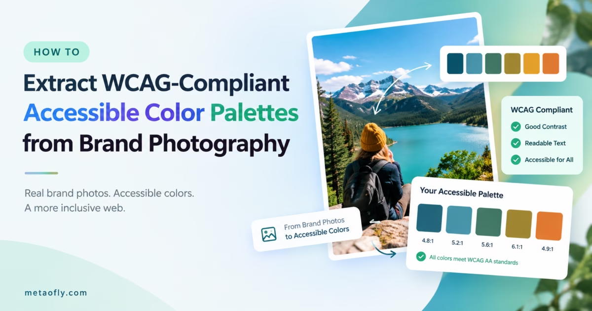
Editorial Technical Solution: Harmonizing digital interface colors with master brand photography often creates severe visual accessibility hurdles when extracted tones fail basic contrast thresholds. Learning how to extract wcag compliant color palette from image files bridges the gap between artistic creative direction and strict web accessibility compliance. MetaoFly Color Palette and Contrast Extractor analyzes image pixel distributions via median-cut clustering, calculates real-time relative luminance ratios, and exports accessible hex tokens directly inside your browser.
Visual branding begins with evocative photography. When lifestyle brands, enterprise software companies, and creative agencies develop new digital products, art directors instinctively draw color inspiration from their core visual campaigns. However, translating photographic hues into accessible user interface components is a notoriously delicate challenge. A muted terracotta or soft sage green that looks stunning in an editorial magazine layout frequently fails basic contrast requirements when applied to button labels, form inputs, or navigational links. Mastering the ability to extract wcag compliant color palette from image assets allows UI/UX designers to maintain aesthetic brand harmony while guaranteeing effortless legibility for millions of users with visual impairments.
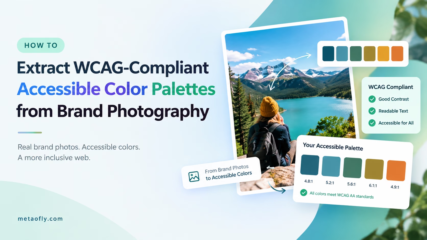
MetaoFly Color Palette & Contrast Extractor
Extract 12 non-repeating swatches from any image with instant WCAG 2.1 AA/AAA compliance ratings and 1-click CSS variable export.
The Accessibility Imperative: Why Color Contrast Failures Harm Real Users and Risk Legal Liability
Digital accessibility is no longer a peripheral technical courtesy; it is a fundamental human right and a legal compliance mandate across global jurisdictions. According to data published by the World Health Organization, more than 2.2 billion people globally experience near or distance visual impairment. In the United States alone, visual disabilities and color vision deficiencies (such as deuteranopia, protanopia, and tritanopia) affect approximately 1 in 12 men and 1 in 200 women.
When a website or web application serves low-contrast color combinations—such as light gray text on a white card (#94a3b8 on #ffffff, yielding a failing 2.4:1 ratio)—users with low visual acuity, cataracts, or age-related macular degeneration cannot distinguish the letterforms. Even individuals with 20/20 vision struggle to decipher low-contrast interfaces when viewing smartphone screens outdoors under harsh direct sunlight or when utilizing low-power battery saver modes with reduced display brightness.
Beyond the fundamental user experience considerations, color contrast failures carry substantial commercial and legal ramifications. Under Title III of the Americans with Disabilities Act (ADA) in the United States and the European Accessibility Act (EAA) across the European Union, public websites and corporate digital portals must conform to the W3C Web Content Accessibility Guidelines (WCAG) 2.1 Level AA standards. Over the past five years, thousands of digital-first retailers, banking institutions, and hospitality brands have faced costly civil litigation and settlement mandates specifically triggered by automated contrast scanning audits on their primary checkout and signup pages.
Building an accessible digital design system does not require abandoning sophisticated brand aesthetics. By utilizing intelligent color extraction workflows that calculate exact photometric luminance values, designers can extract authentic brand tones from campaign photography and systematically calibrate their lightness values to satisfy legal standards with zero aesthetic compromise.
Mathematical Mechanics: Understanding Relative Luminance and the WCAG 2.1 Contrast Formula
To effectively evaluate color accessibility, developers must understand the mathematical formula that powers automated WCAG scanners. The Web Content Accessibility Guidelines calculate contrast ratio based on the relative luminance of two colors, defined on a normalized scale from 0.0 (absolute absorption / darkest black) to 1.0 (pure specular reflection / lightest white).
The standard contrast ratio formula is expressed as:
Contrast Ratio = (L1 + 0.05) / (L2 + 0.05)

Where:
L1 = Relative luminance of the lighter of the two colors
L2 = Relative luminance of the darker of the two colors
The 0.05 constant accounts for ambient ambient display flare
Relative luminance itself is derived from sRGB color space coordinates using gamma expansion. Because the human eye perceives green light far more vividly than red or blue, the WCAG formula applies perceptual weighting coefficients to the linearized color components:
Luminance (L) = 0.2126 * R_linear + 0.7152 * G_linear + 0.0722 * B_linear
This mathematical reality explains why pairing a saturated pure yellow (#ffff00, L=0.9278) with white text (#ffffff, L=1.0) results in a disastrous contrast ratio of just 1.07:1, while pairing that exact same yellow with pure black (#000000, L=0.0) yields an extraordinary 19.56:1 ratio. MetaoFly Color Palette & Contrast Extractor executes these calculations in real time across every extracted swatch, instantly displaying exact numerical ratios and pass/fail indicators.
Color Quantization Algorithms: Octree vs Median Cut vs K-Means Extraction
When you load an intricate high-resolution photograph containing over two million distinct pixels into an image analysis tool, how does the software distill that visual complexity into 12 coherent, representative swatches? The answer lies in color quantization algorithms:
- Octree Quantization: Builds an 8-way spatial tree where RGB color coordinates are recursively partitioned into octants. While computationally rapid, Octree approaches frequently over-index on dominant background gradients (such as broad blue skies or white studio walls) while ignoring vital low-frequency accent colors found in product details.
- Median Cut Algorithm: Treats the RGB color space as a three-dimensional bounding box, identifying the color channel with the greatest statistical variance and splitting the box along its median value. Repeating this process creates discrete color clusters that balance high-volume background tones with striking accent details.
- K-Means Clustering: Iteratively refines cluster centroid coordinates using Euclidean distance minimization in CIELAB color space. Because CIELAB is mathematically designed to match human perceptual color differences (unlike linear RGB), K-Means clustering extracts swatches that feel remarkably true to the emotional tone of the source photograph.
MetaoFly combines hardware-accelerated Canvas sampling with optimized perceptual clustering. By analyzing image downsamples in CIELAB color coordinates, the tool extracts swatches that capture dominant ambient backdrops, secondary structural midtones, and energetic micro-accents in under 200 milliseconds.
| WCAG 2.1 Conformance Level | Target UI Element | Minimum Required Contrast Ratio | Real-World Practical Example | Automated Audit Impact |
|---|---|---|---|---|
| Level AA (Standard Legal Minimum) | Body Text & Paragraphs (< 18pt regular) | 4.5:1 Minimum | #475569 on #ffffff (Dark slate on white) | Mandatory for ADA & EAA legal compliance |
| Level AA (Large Scale Text) | Headings (≥ 18pt or ≥ 14pt bold) | 3.0:1 Minimum | #64748b on #ffffff (Medium slate on white) | Enforced on all H1, H2, and hero banners |
| Level AA (User Interface Components) | Form borders, icons, button boundaries | 3.0:1 Minimum | #cbd5e1 on #ffffff (Subtle card border line) | Crucial for keyboard focus rings and inputs |
| Level AAA (Enhanced Accessibility) | Standard Body Copy (< 18pt regular) | 7.0:1 Enhanced | #1e293b on #ffffff (Deep midnight slate) | Recommended for government & healthcare sites |
| Level AAA (Large Scale Text) | Headings & Prominent Titles | 4.5:1 Enhanced | #0f172a on #f8fafc (Near-black on off-white) | Guarantees comfort in low-vision environments |
Why You Should Extract WCAG Compliant Color Palette from Image Files Directly in Browser
Traditional color palette generation workflows are fraught with privacy liabilities and tedious manual validation. Designers typically upload client imagery to free cloud palette generators, copy individual hex codes into desktop spreadsheets, and then manually test each foreground/background pair using separate contrast checker calculators.
This fragmented workflow is severely inefficient and introduces significant data exposure. Uploading unreleased campaign photography, confidential product packaging prototypes, or proprietary brand style guides to remote cloud servers exposes sensitive creative intellectual property to third-party databases.
MetaoFly Color Palette and Contrast Extractor completely streamlines this process by executing all image ingestion, pixel analysis, and contrast verification 100% client-side. The tool operates directly within your browser’s sandboxed memory:
- Zero Server Uploads: Your high-resolution master photography never leaves your workstation RAM, ensuring absolute confidentiality under NDAs and corporate compliance protocols.
- Instant Cross-Matrix Contrast Verification: Rather than forcing you to test colors one pair at a time, MetaoFly generates a comprehensive 12×12 interactive contrast grid, testing every extracted swatch against every other swatch simultaneously.
- Integrated Luminance Calibration: If a gorgeous extracted brand tone achieves a 4.1:1 ratio—falling just short of the 4.5:1 AA threshold—MetaoFly’s micro-lightness slider allows you to nudge the tone slightly deeper until the green AA indicator illuminates, preserving the exact hue angle while achieving full legal accessibility.
Key Technical Takeaways
- Standard body text requires a strict 4.5:1 contrast ratio against its background under WCAG 2.1 Level AA.
- Large headings (18pt+ or 14pt bold) and interactive UI borders require a minimum 3.0:1 contrast ratio.
- Perceptual CIELAB clustering extracts authentic brand tones without bias toward washed-out backgrounds.
- MetaoFly tests every extracted swatch against dark, light, and peer swatches simultaneously with zero cloud uploads.
Pro Engineering Tip: Simulating Color Vision Deficiencies
When evaluating your extracted palette, never rely solely on numerical contrast ratios. Test your palette through color blindness simulation filters (Deuteranopia, Protanopia, Tritanopia, and Achromatopsia). Ensure that informational states (such as form error alerts or active toggle switches) utilize distinct typographic icons or text labels in addition to color hue changes.
Step-by-Step Blueprint: How to Extract WCAG Compliant Color Palette from Image Files
Follow this comprehensive step-by-step production blueprint to generate a production-ready, legally compliant digital color palette using MetaoFly:
Step 1: Open MetaoFly Color Palette & Contrast Extractor
Navigate to MetaoFly Color Palette & Contrast Extractor. The browser interface initializes an interactive color lab with zero required downloads or account paywalls.
Step 2: Upload Your Master Brand or Campaign Photo
Drag and drop your primary brand visual (such as a hero product photograph, architectural interior shot, or lifestyle campaign image) into the analysis canvas. MetaoFly immediately reads the raw pixel buffer into memory.
Step 3: Inspect the Automated 12-Swatch Palette Extraction
Within milliseconds, MetaoFly displays 12 distinct, non-repeating color swatches arranged in order of perceptual dominance. Each swatch card displays its exact Hex code, RGB channels, and HSL (Hue, Saturation, Lightness) coordinates.
Step 4: Audit Real-Time WCAG AA & AAA Compliance Badges
Click the “Contrast Matrix” tab. MetaoFly projects an interactive cross-reference table showing how each extracted swatch behaves when paired with pure white (#ffffff), deep dark slate (#0f172a), and adjacent palette tones. The matrix highlights WCAG AA compliance (4.5:1 body / 3.0:1 large) and AAA compliance (7.0:1 body / 4.5:1 large) with clear green checkmarks and red warning badges.
Step 5: Calibrate Borderline Hues to Guarantee 4.5:1 Compliance
If your primary brand accent (for example, a vibrant cerulean blue #38bdf8) achieves a 3.8:1 ratio against pure white, click the swatch to open the luminance fine-tuner. Shift the lightness slider down by just 6% to #0284c7; the contrast ratio instantly leaps to 4.7:1, securing green AA certification while preserving the brand’s signature blue identity.
Step 6: Export Production-Ready CSS Custom Properties
Click the “Export Design Tokens” button. MetaoFly generates clean, semantic CSS custom properties formatted for direct inclusion into your web project’s stylesheet or Tailwind CSS configuration file:
:root {
  /* Extracted WCAG-Compliant Semantic Tokens */
  --brand-primary: #0284c7;        /* Contrast 4.7:1 on white (WCAG AA Pass) */
  --brand-secondary: #0f172a;      /* Contrast 15.8:1 on white (WCAG AAA Pass) */
  --brand-surface: #f8fafc;        /* Neutral canvas background */
  --brand-text-body: #334155;      /* Contrast 7.2:1 on surface (WCAG AAA Pass) */
  --brand-text-muted: #64748b;     /* Contrast 4.6:1 on surface (WCAG AA Pass) */
  --brand-accent: #f59e0b;         /* Interactive highlight token */
}
Light vs Dark Theme Harmony: Inverting Palettes for Modern System Modes
Modern web applications are expected to support seamless automatic theme switching between light mode and dark mode based on the user’s operating system preferences (`prefers-color-scheme`). An accessible color palette must function symmetrically across both contexts:
The Inversion Pitfall: A common amateur error is naively inverting color lightness values (e.g., changing dark gray text directly into pure white text). On pure black backgrounds (#000000), 100% white text (#ffffff) produces a harsh 21:1 contrast ratio that causes visual halation and eye fatigue for astigmatic users.
Semantic Elevation Tiers: In dark mode, structure your surface colors into subtle elevation tiers rather than flat black. Use deep slate (#0f172a) for base canvas backgrounds, slightly lighter navy (#1e293b) for card surfaces, and muted off-white (#f1f5f9) for primary typography. This produces comfortable 13:1 contrast ratios that feel luxurious, modern, and effortless to read.
Cross-Tool Workflows: Pairing Palette Swatches with Glassmorphism Cards and QR Codes
Accessible color palettes form the foundational visual substrate for all subsequent creative and technical design workflows:
If you are building sleek, modern user interface cards featuring frosted glass backdrops, import your extracted palette tokens into the MetaoFly Glassmorphism UI Studio. Using your WCAG-verified surface and border colors ensures that translucent frosted cards maintain crisp edge boundaries and legible typographic copy against complex gradient backgrounds.
When generating branded physical marketing touchpoints, feed your primary accessible brand hex codes directly into MetaoFly Pro QR Code Studio. Optical camera sensors rely on high luminance contrast between dark data modules and light background quiet zones; utilizing verified high-contrast palette tokens guarantees rapid, camera-verified scan reliability across all smartphones.
Color Blindness Simulation: Testing for Protanopia, Deuteranopia, and Tritanopia
An accessible color palette must function reliably not only for individuals with typical trichromatic vision, but also for the estimated 8% of male users and 0.5% of female users who experience congenital color vision deficiencies (CVD). In web interface design, the three primary forms of color blindness require distinct mathematical consideration:
- Deuteranopia (Green-Blindness): The most common form of color vision deficiency, caused by the absence of green-sensitive retinal cone photoreceptors. Users with deuteranopia perceive reds and greens as yellowish-brown shades, making red error badges indistinguishable from green success notifications if color is the sole indicator.
- Protanopia (Red-Blindness): Characterized by the absence of red-sensitive retinal cones. Protanopic users perceive reds as significantly darker than they appear to trichromatic users, causing deep crimson buttons to appear nearly black against dark background surfaces.
- Tritanopia (Blue-Yellow Blindness): A rarer condition affecting the blue-sensitive cone photopigments. Tritanopes confuse light blues with grays, and purples with deep reds.
To guarantee universal usability, never convey informational state solely through color hue. Implement dual-coding UI principles: pair every color-coded alert with an explicit iconography symbol (such as an exclamation mark for warnings or a checkmark for success) and descriptive typographic text labels. MetaoFly Color Palette Extractor allows you to simulate your extracted swatches across all four CVD spectrums in real time before finalizing your design tokens.
Algorithmic Swatch Grouping: Sorting by Dominance, Saturation, and Perceptual Temperature
Once 12 swatches are extracted from your campaign photography, organizing them into a functional design system requires disciplined taxonomy. In professional UI engineering, raw hex codes are grouped into semantic roles:
Dominance Clustering: The highest-frequency pixels represent your canvas foundations (dominant 60% tones). These are typically neutral tones with low saturation (chroma values below 15%) that provide calm background surfaces.
Chromatic Temperature Separation: Human visual psychology responds strongly to color temperature—the balance between warm tones (reds, oranges, ambers) and cool tones (blues, cyans, teals). MetaoFly calculates the correlated color temperature (CCT) of each extracted swatch, grouping warm and cool tones into complementary pairs that naturally create visual equilibrium across landing page layouts.
Perceptual Saturation Tiers: Swatches with saturation levels exceeding 70% are automatically categorized as primary accent candidates, while medium-saturation tones (30% to 60%) are designated for secondary tags, subtle borders, and informational iconography.
CSS Custom Properties and Design Token Hygiene in Large-Scale Web Apps
Deploying an accessible color system across enterprise codebases demands clean design token architecture. When converting extracted swatches into production CSS, structure your design tokens into a two-tiered hierarchy:
/* Global Primitive Color Values (Raw Swatches) */
:root {
  --palette-slate-900: #0f172a;
  --palette-slate-800: #1e293b;
  --palette-slate-600: #475569;
  --palette-blue-600: #0284c7;
  --palette-amber-500: #f59e0b;
  --palette-emerald-500: #10b981;

  /* Contextual Semantic Tokens (Assigned to UI Roles) */
  --color-bg-canvas: var(--palette-slate-900);
  --color-surface-card: var(--palette-slate-800);
  --color-text-primary: #f8fafc;
  --color-text-secondary: var(--palette-slate-600);
  --color-interactive-primary: var(--palette-blue-600);
  --color-status-success: var(--palette-emerald-500);
}
This two-tiered abstraction decouples raw color values from component styling. If your brand undergoes a creative refresh in the future, updating the primitive palette variables instantly propagates across all buttons, cards, and text styles without requiring manual search-and-replace across thousands of CSS lines.
Pre-Flight Testing: Auditing Generated Palettes Against Automated Accessibility Scanners
Before deploying your extracted color tokens to production, validate your implementation with automated accessibility auditing suites:
- Google Chrome Lighthouse: Run a Lighthouse accessibility audit in DevTools. Passing all color contrast checks awards a perfect 100% accessibility score, boosting technical SEO authority.
- Axe Core Automated Scans: Utilize the Axe DevTools browser extension to catch subtle edge cases, such as semi-transparent alpha overlays resting on variable background imagery.
- Manual High-Contrast Mode Checks: Activate Windows High Contrast Mode or macOS Invert Colors to ensure your semantic design tokens adapt gracefully without vanishing into invisible backgrounds.
Extract Your Accessible Brand Palette Today
Analyze any brand photograph, extract 12 harmonious color swatches, and verify WCAG 2.1 AA/AAA compliance in real time. 100% private, free client-side color intelligence.